Popular Posts
-
I have used every one of these resources as a graphic designer and website developer and have hand picked all of these resources based on th...
-
The Indian finance ministry has begun a public competition to select a design for the symbol of ...
-
BADGES Web 2.0 Badges - A set of free badges to download and use in your own designs. Fresh Badge - Quickly generate your own badge. adClu...
-
Navigation menus have really important role in any website. For big sites full with a lot of pages and articles, drop down menus and tabs ar...
-
For web designers and graphic designers, gradients provide almost unlimited options for creating the perfect look. This list is a collection...
-
During current economical times, it’s becoming increasingly difficult to find and secure good clients. A “good” client is one who plays on t...
-
Professional networking is an important part of being a designer and working towards a challenging and rewarding career. Unfortunately, most...
-
Within the music industry there is a great variety in terms of the quality of websites. Some bands have excellent, creative websites, and ot...
-
We live in a world surrounded by Times New Roman, Arial and Helvetica, typefaces so functional that they have long since become boring. It’s...
-
MailShadowG is an application that will allow you to sync Outlook with Gmail. MailShadowG is a product of Cemaphore Systems , a California b...
Market information
Blog Archive
Website Designing
- Website Designing (133)
- design (100)
- Design Reviews (63)
- web 2.0 (63)
- Cool Websites (61)
- Photoshop (59)
- Tech News (53)
- Social Media Network (50)
- Search Engine Optimization (44)
- Usability (42)
- tutorials (38)
- Graphic (37)
- Insights (33)
- css (28)
- inspiration (26)
- Internet Marketing (25)
- Freelancing (23)
- google (23)
- Current Economic Scenario (17)
- Branding (15)
- accessibility (13)
- showcase (13)
- Image Optimization (12)
- Internet (12)
- Offshore (12)
- Online Advertising (12)
- Typography (12)
- gallery (12)
- Illustrator (11)
- Outsourcing (11)
- Social Media Optimization (11)
- web 3.0 (11)
- Game (10)
- Microsoft (10)
- Logos (9)
- Programming (9)
- Quote (9)
- Software (8)
- Yahoo (8)
- Download (7)
- EVENTS (6)
- HTML5 (6)
- Layouts (6)
- VC Funding (6)
- javascript (6)
- Crazy Boyz (5)
- Fonts (5)
- History (5)
- Ajax (4)
- Books (4)
- Content Management (4)
- Email Marketing (4)
- PPC (4)
- RSS (4)
- dark (4)
- twitter (4)
- wordpress (4)
- Affiliate (3)
- Blog (3)
- Facebook (3)
- Movies (3)
- SEO (3)
- flash (3)
- trends (3)
- Application (2)
- Apps (2)
- Diseases (2)
- Flat Design (2)
- Shopify (2)
- music (2)
- open source (2)
- ATT (1)
- Apple (1)
- Chrome (1)
- Dailer (1)
- Earn Money (1)
- IPL Broadcast (1)
- South Africa (1)
- Technology (1)
- Voice Video Text Chat (1)
- Wordpress themes (1)
- Youtring (1)
- android (1)
- business cards (1)
- colors (1)
- drupal (1)
- electronics (1)
- iPhone (1)
- podcast (1)
Blog offering website designing, website development, digital media marketing, social media strategies, facebook application development and services for online branding.
25 Beautiful Examples of “Coming Soon” Pages
"Coming soon" pages are a great way to tide over your visitors until you finish your new website. They can be used as a teaser for your future website, or places to simply put your information where people can get to it while you are under digital construction. We are going to look at a collection of how websites are successfully using "coming soon" pages.
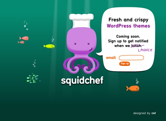
1. SquidChef
SquidChef has a cute under-the-sea theme and an illustrated squid character to go with their name "SquidChef". Having a character illustration like this almost ensures that the site is going to have a friendly feel. (Check out some more illustrated character designs). I also like the idea of putting all the information into the talk bubble.
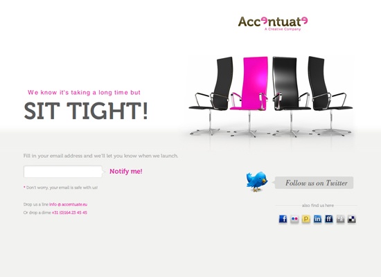
2. Accentuate
I like the color scheme of this "coming soon site". It’s a simple theme that uses pink to highlight the important areas. The colors go well with the simple layout of the website and the image of the chairs makes the website more interesting than just having text.
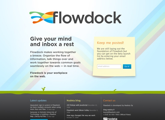
3. Flowdock
Having an illustrated look to a website usually gives it more of a fun and laidback feel. It has a bright and welcoming color palette, and I like how the headings in the three sections in the footer are different colors. It makes the color flow throughout.
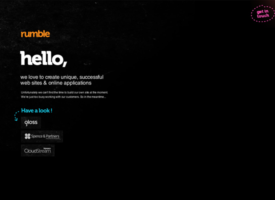
4. Rumble Labs
Usually when you say "hello" right off the bat, it gives off a friendly vibe, and despite the dark background, this page gives that endearing feeling. The bright highlight colors help emphasize that point, as well as the arrow and dotted lines.
5. Irava Stefan
I like the hovering logo – it creates a sort of 3D look, which gives the page a little more dimension. Also, what makes this site interesting is that when you hover over the logo and Twitter icon with your mouse, it displays more information. (Learn how to create 3D text via this tutorial).
6. chocolatepool
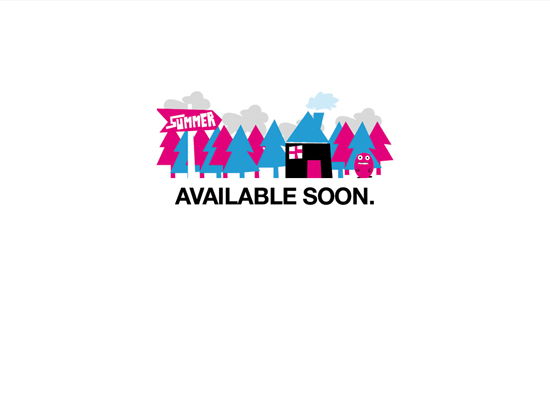
The brightly colored quirky illustration gives a good sense of what the style of work could be, or at the very least, gives fun laidback feel. The sign that says, "summer" integrated into the illustration gives a hint as to when the website will launch.
7. Berengere Monin
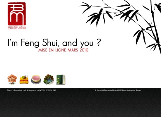
This website has a very nice clean and simple look. I like the Asian-inspired style, with the tree/plant on the right and the black, white and red color scheme. It gives the "coming soon" page a nice sense of simplicity.
8. Birdboxx
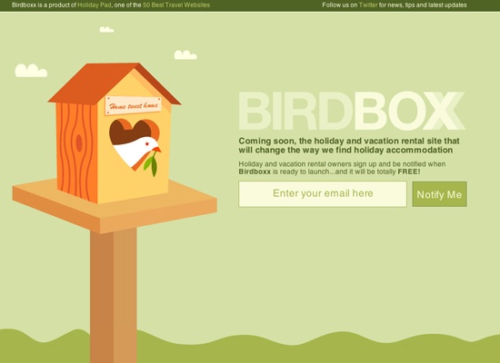
This is a successful illustrated "coming soon" web page. This site pours out a peaceful and calming character with the green colors and the white dove.
9. Creative Joomla! Design Book
I like the sketchy-style of this soon-to-launch page. Not only is it a fun layout, but it is also useful, with the "be updated" web form mixed in to the design. This "coming soon" page gives you ways of keeping in touch, by including Twitter and email options into the composition.
10. Lilly’s Table
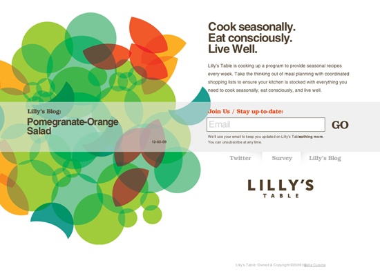
The color palette is what really draws me to this website. The colors have a slight retro feel (learn how to create a retro color scheme), but it still gives off a bright, clean, vibrant feel. In addition, I like how the last post from their blog is displayed on the left.
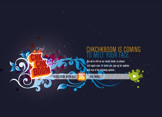
11. ChkChkBoom
I like the paint splatter effect, which they use to draw attention to the important parts of the layout. They also use some bright colors to emphasize certain areas like the headline, and the green play button which is used for the RSS email feed.
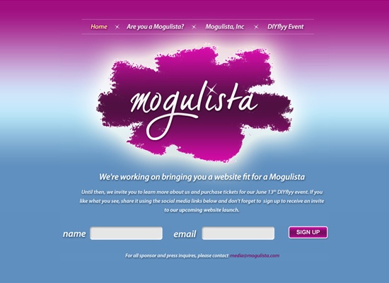
12. Mogulista
This website gives off a glamorous countenance, and that is probably because the business is geared towards women, who typically find these sorts of theme appealing. What really struck me about this "coming soon" site was the navigation. They use a nice animation that keeps you on the same page but rolls in and out new text below the logo.
13. Dialed Tone
I like the usage of the 3D dial, as well as the shadows on the "coming soon" box and the sign up button, which give the site a lot more dimension.
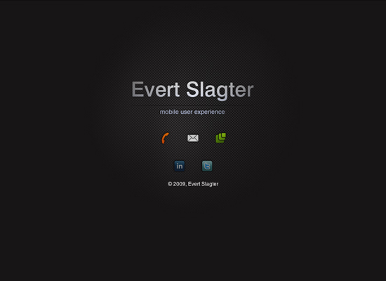
14. Evert Slagter
The icons are a nice touch considering they work with mobile user experience. I also like the simplicity and the subtle light glow in the background that gives it a little more depth that just having a black background.
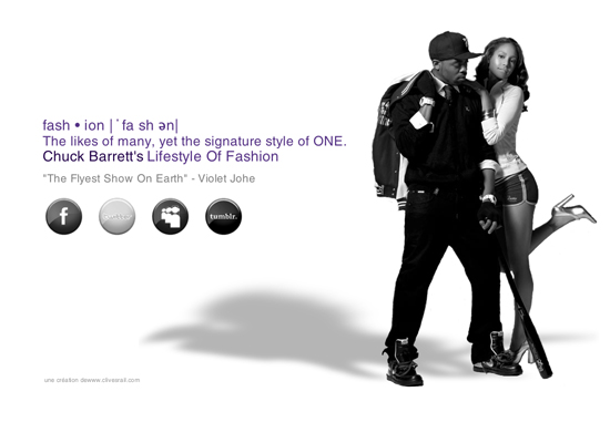
15. Chuck Barrett
I think when I look at this, I immediately get an idea for what kind of style of fashion will be on the future website with the black and white photo. I also like the idea of having the icons in grayscale, which goes with the photo, and how, when you hover over them, they change to colored.
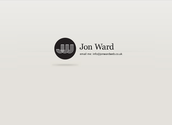
16. Jon Ward
At first glance, this is your run-of-the-mill name, logo, and title "coming soon" page, but if you stay on it for a second or two, you’ll notice that where the job title is, is actually an animation that rotates the title, email and phone number. It’s a great way to present that little bit more information, and at the same time keep the page as simple, but engaging, as possible.
17. FILTERED.LANGUAGE
The logo has a techno look to it, which was why it drew me to the site in the first place. It turns out that it’s for a poetry publication. Regardless, the logo, which gives this "coming soon" page a nice dose of color, is spectacular.
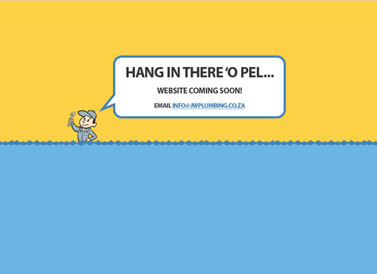
18. Johnny Walker Plumbing
I love how simple the look is, but you can still get the impression that he is a plumber at someone’s house fixing their flooded toilet or sink. It is simple but effective.
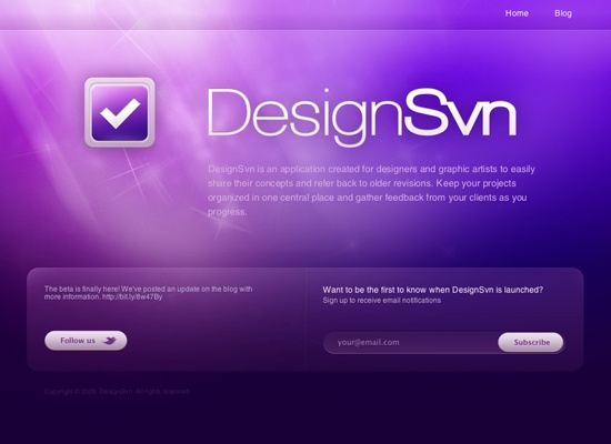
19. DesignSvn
I always love good Photoshop lighting work, and this website has it working really well with the web 2.0ish Twitter and subscribe icons.
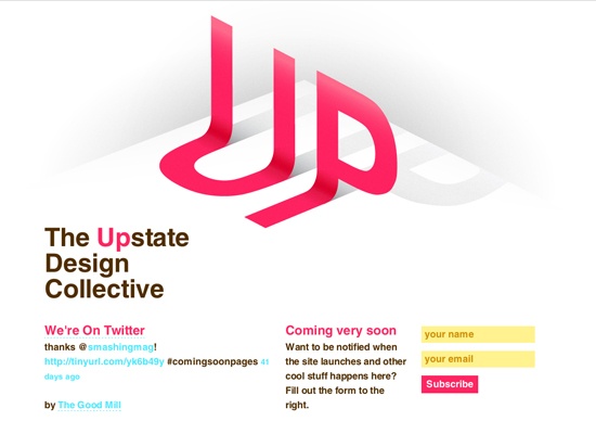
20. Upstate Design Collective
Other than the 3D effects, I really like how the bright fresh colors make the website stand out.
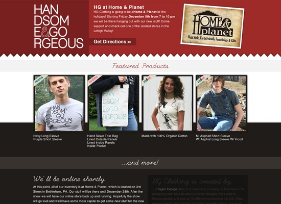
21. Handsome and Gorgeous Clothing
I think that it is important to showcase your merchandise, even if your website isn’t finished yet. I also like the use of the jagged edge, giving it a layered fabric feel, which is appropriate for what they are selling.
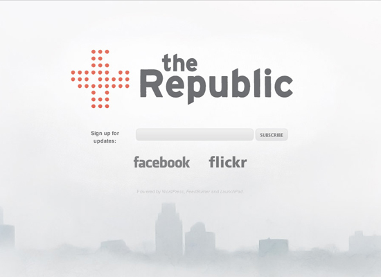
22. The Republic
I like the white design with the subtle cityscape at the bottom; it gives it an interesting look. I also like how they use gray colors instead of the typical black on white, which gives it a less harsh look and helps to make the logo mark stand out more.
23. Gimmr
Not only does this "coming soon" page have a color scheme that I really like, it also has a unique feature. You can upload a photo of yourself and add glasses to your portrait so you can look like the character/mascot to the left (which you can then use as your avatar).
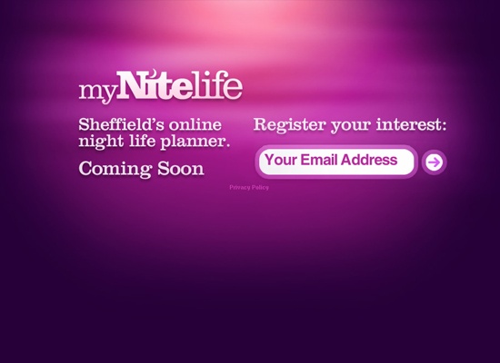
24. myNiteLife
This is another website that uses some nice lighting effects, and the purple colors give it a night feel that goes perfectly with their name (myNightlife).
25. FavMovie!
It seems like they are using their "coming soon" page as more of a teaser, not really saying what they’re all about. All I can gather is that it has something to do with about movies (probably). If you want to find out, you can sign up for email updates.








Comments[ 0 ]
Post a Comment