Popular Posts
-
I have used every one of these resources as a graphic designer and website developer and have hand picked all of these resources based on th...
-
BADGES Web 2.0 Badges - A set of free badges to download and use in your own designs. Fresh Badge - Quickly generate your own badge. adClu...
-
The Indian finance ministry has begun a public competition to select a design for the symbol of ...
-
Navigation menus have really important role in any website. For big sites full with a lot of pages and articles, drop down menus and tabs ar...
-
For web designers and graphic designers, gradients provide almost unlimited options for creating the perfect look. This list is a collection...
-
Professional networking is an important part of being a designer and working towards a challenging and rewarding career. Unfortunately, most...
-
During current economical times, it’s becoming increasingly difficult to find and secure good clients. A “good” client is one who plays on t...
-
Within the music industry there is a great variety in terms of the quality of websites. Some bands have excellent, creative websites, and ot...
-
We live in a world surrounded by Times New Roman, Arial and Helvetica, typefaces so functional that they have long since become boring. It’s...
-
MailShadowG is an application that will allow you to sync Outlook with Gmail. MailShadowG is a product of Cemaphore Systems , a California b...
Market information
Blog Archive
Website Designing
- Website Designing (133)
- design (100)
- Design Reviews (63)
- web 2.0 (63)
- Cool Websites (61)
- Photoshop (59)
- Tech News (53)
- Social Media Network (50)
- Search Engine Optimization (44)
- Usability (42)
- tutorials (38)
- Graphic (37)
- Insights (33)
- css (28)
- inspiration (26)
- Internet Marketing (25)
- Freelancing (23)
- google (23)
- Current Economic Scenario (17)
- Branding (15)
- accessibility (13)
- showcase (13)
- Image Optimization (12)
- Internet (12)
- Offshore (12)
- Online Advertising (12)
- Typography (12)
- gallery (12)
- Illustrator (11)
- Outsourcing (11)
- Social Media Optimization (11)
- web 3.0 (11)
- Game (10)
- Microsoft (10)
- Logos (9)
- Programming (9)
- Quote (9)
- Software (8)
- Yahoo (8)
- Download (7)
- EVENTS (6)
- HTML5 (6)
- Layouts (6)
- VC Funding (6)
- javascript (6)
- Crazy Boyz (5)
- Fonts (5)
- History (5)
- Ajax (4)
- Books (4)
- Content Management (4)
- Email Marketing (4)
- PPC (4)
- RSS (4)
- dark (4)
- twitter (4)
- wordpress (4)
- Affiliate (3)
- Blog (3)
- Facebook (3)
- Movies (3)
- SEO (3)
- flash (3)
- trends (3)
- Application (2)
- Apps (2)
- Diseases (2)
- Flat Design (2)
- Shopify (2)
- music (2)
- open source (2)
- ATT (1)
- Apple (1)
- Chrome (1)
- Dailer (1)
- Earn Money (1)
- IPL Broadcast (1)
- South Africa (1)
- Technology (1)
- Voice Video Text Chat (1)
- Wordpress themes (1)
- Youtring (1)
- android (1)
- business cards (1)
- colors (1)
- drupal (1)
- electronics (1)
- iPhone (1)
- podcast (1)
Blog offering website designing, website development, digital media marketing, social media strategies, facebook application development and services for online branding.
Design Trends (Predictions)
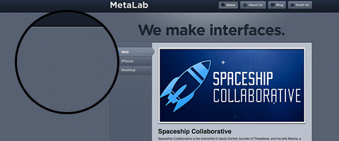
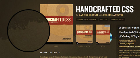
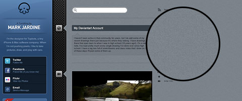
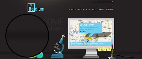
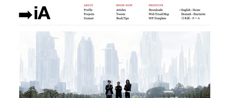
As we are stepping in a new decade, I can foresee that web design in 2010 is going to be fun and filled with experimental works. With the new CSS3 and HTML5, designers and developers are trying to utilize the new features to create impressive designs. Sketchy and large background styles are fading out. Serif fonts and texturized background will be popular. Thanks to CSS3, we are going to see a lot of rounded corners, RGBA transparency, and drop shadows. With the rise of smart phones, mobile web design is going to pick up this year.
Serif Fonts
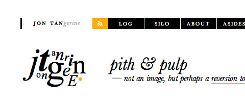
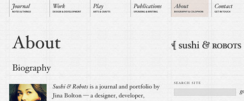
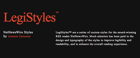
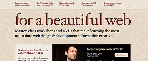
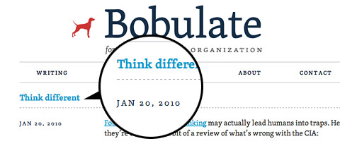
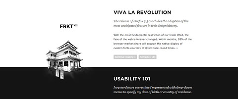
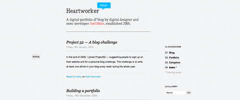
In the last decade, most web sites were designed in either Verdana or Arial (sans-serif fonts), but that is going to change in this new decade. Serif fonts will get more attention. Read this article to find out why: Next Serif Trend.
Big Headings
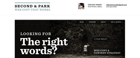
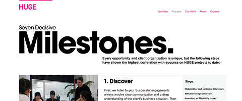
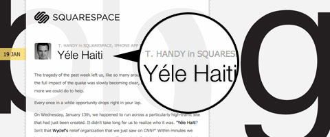
Big headings in header (as part of design interface) will gain more popularity in 2010.
Custom Font Embedding
As Typekit is expanding their font list and more free quality fonts are available (e.g. FontSquirrel, OpenType, and The League of MoveableType), I think more people will use custom font embedding in the coming year.
Texturized Background
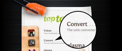
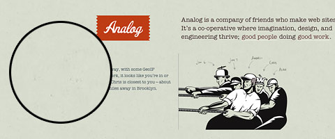
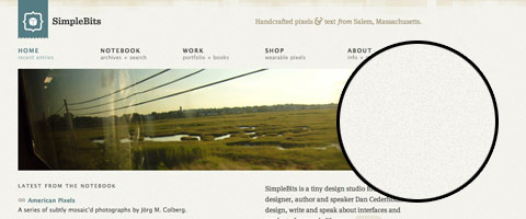
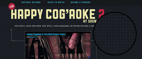
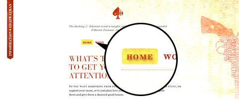
The big background trend is going to be gradually out-of-date and be replaced with subtle and texturized (particularly the light noise) background.
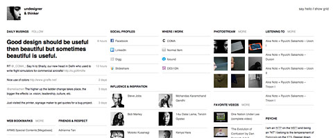
Minimalist & Grid
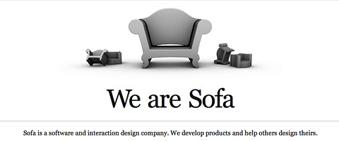
Minimalist and grid designs are not today’s new. They have been popular for the past couple years and I think it will continue to grow in 2010. Check out my previous post for more minimalist sites.
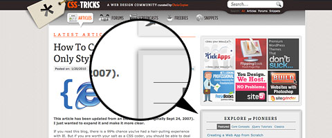
CSS3 New Features
Although CSS3 is not fully supported by all browsers yet, but a lot of designers are experimenting with the new features such as: rounded corners, multi background images, multi-column, border images, and animation. The following sites show good implementation of CSS3’s new features with fallbacks. So, we will see more and more CSS experimental works.
CSS3 Animation
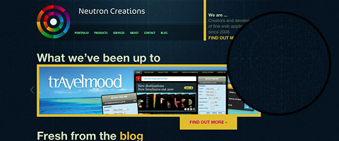
Neutron Creations’s blog uses webkit-transform to spin the circle graphics (view it with Mac Chrome or Safari). If your browser doesn’t support webkit-transform, it will just show the static circles.
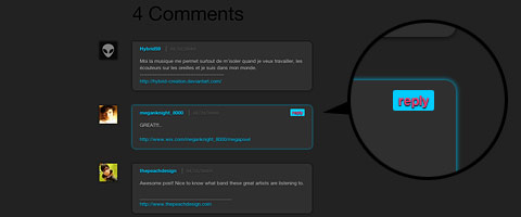
Rounded Borders and Box Shadows
Border-radius and box-shadow are the most commonly used CSS3 properties.
Text Shadow
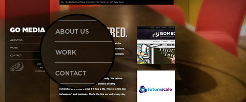
A lot of designers are using text shadow to add more depth to text.
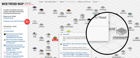
RGBA & Opacity
RGBA makes setting background opacity easier. I think more designers are going to take advantage of this feature to create semi-transparent effect.
Mobile Design
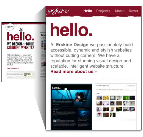
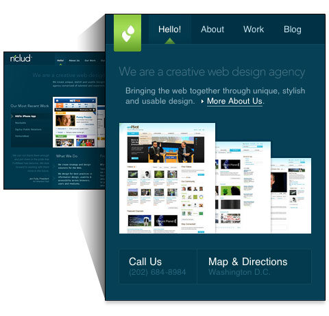
Since the release of iPhonein 2007, everybody is talking about mobile design. Now with more smart phones that support full CSS and Javascript, mobile design is definitely going to be the future of web design. A lot of sites(ranging from design agencies to editorial sites to web apps) are offering a mobile version. Below are some great examples (screenshots are captured with iPhone).























Comments[ 1 ]
it`s a very good post for desingers who are looking for a new dimension in this field.
Post a Comment