Popular Posts
-
I have used every one of these resources as a graphic designer and website developer and have hand picked all of these resources based on th...
-
BADGES Web 2.0 Badges - A set of free badges to download and use in your own designs. Fresh Badge - Quickly generate your own badge. adClu...
-
The Indian finance ministry has begun a public competition to select a design for the symbol of ...
-
Navigation menus have really important role in any website. For big sites full with a lot of pages and articles, drop down menus and tabs ar...
-
For web designers and graphic designers, gradients provide almost unlimited options for creating the perfect look. This list is a collection...
-
Professional networking is an important part of being a designer and working towards a challenging and rewarding career. Unfortunately, most...
-
During current economical times, it’s becoming increasingly difficult to find and secure good clients. A “good” client is one who plays on t...
-
Within the music industry there is a great variety in terms of the quality of websites. Some bands have excellent, creative websites, and ot...
-
We live in a world surrounded by Times New Roman, Arial and Helvetica, typefaces so functional that they have long since become boring. It’s...
-
MailShadowG is an application that will allow you to sync Outlook with Gmail. MailShadowG is a product of Cemaphore Systems , a California b...
Market information
Blog Archive
Website Designing
- Website Designing (133)
- design (100)
- Design Reviews (63)
- web 2.0 (63)
- Cool Websites (61)
- Photoshop (59)
- Tech News (53)
- Social Media Network (50)
- Search Engine Optimization (44)
- Usability (42)
- tutorials (38)
- Graphic (37)
- Insights (33)
- css (28)
- inspiration (26)
- Internet Marketing (25)
- Freelancing (23)
- google (23)
- Current Economic Scenario (17)
- Branding (15)
- accessibility (13)
- showcase (13)
- Image Optimization (12)
- Internet (12)
- Offshore (12)
- Online Advertising (12)
- Typography (12)
- gallery (12)
- Illustrator (11)
- Outsourcing (11)
- Social Media Optimization (11)
- web 3.0 (11)
- Game (10)
- Microsoft (10)
- Logos (9)
- Programming (9)
- Quote (9)
- Software (8)
- Yahoo (8)
- Download (7)
- EVENTS (6)
- HTML5 (6)
- Layouts (6)
- VC Funding (6)
- javascript (6)
- Crazy Boyz (5)
- Fonts (5)
- History (5)
- Ajax (4)
- Books (4)
- Content Management (4)
- Email Marketing (4)
- PPC (4)
- RSS (4)
- dark (4)
- twitter (4)
- wordpress (4)
- Affiliate (3)
- Blog (3)
- Facebook (3)
- Movies (3)
- SEO (3)
- flash (3)
- trends (3)
- Application (2)
- Apps (2)
- Diseases (2)
- Flat Design (2)
- Shopify (2)
- music (2)
- open source (2)
- ATT (1)
- Apple (1)
- Chrome (1)
- Dailer (1)
- Earn Money (1)
- IPL Broadcast (1)
- South Africa (1)
- Technology (1)
- Voice Video Text Chat (1)
- Wordpress themes (1)
- Youtring (1)
- android (1)
- business cards (1)
- colors (1)
- drupal (1)
- electronics (1)
- iPhone (1)
- podcast (1)
Blog offering website designing, website development, digital media marketing, social media strategies, facebook application development and services for online branding.
What to Expect in 2010: UX/UI Design Simplicity
In January of each year, we flip over the hourglass and, once again, we have everything in front of us. The new year gives us a clean slate, a chance for change and encouragement to evolve the way we do things. In the past, we’ve yielded to client and user requests to pack our website designs full of unrelated features and countless pages of duplicate information. The change we have been waiting for has come - our users have matured. 2010 is the year of Design Simplicity.
Clean and Simple
There are many design trends this year, however, I feel it is important to focus specifically on the movement of Design Simplicity. In fact, as the web evolves, it is our responsibility as designers to keep the order of things. This means fewer pages, less clicks, less clutter and more whitespace. In 2010, clean is King and our users are asking for it. I don’t blame them. With access to an increasing amount of information on the web everyday, our attention span is naturally diminishing. Now, more than ever, design needs to engage the user, provide succinct information and allow them to go on their merry way. Who knows, maybe airlines and banks will even clean up their 1990s design.
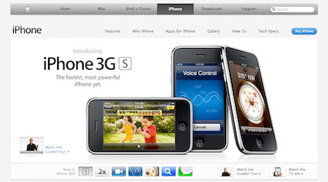
Now Design Simplicity does not mean removing functionality or access to information. This trend of simplicity is not as easy as reducing the elements and content in your user interface. To achieve the less is more effect, you have to develop a valuable user experience by utilizing a creative toolset. Think of the iPhone - the greatest innovation in modern mobile phones has only one button.
Single Page Websites
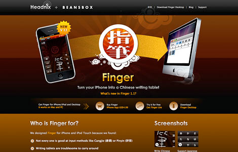
Each time a visitor clicks deeper into your site, a fraction of their interest dies. With the evolution of users, you can get to the point quickly. So in order to keep visitors’ attention, many designers are providing access to the core items needed to make an impression front and center. Think of the homepage as the main interface to all of the website’s content.When you start to layer some of the below items on the list including sliders, modal boxes and toolbars, you can provide pages of information without clicking off the page. iPhone App websites are a great example of single page websites in action.
Sliders
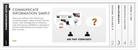
Sliders are a great way to provide indirect and precise content through a simple and visual interface. Instead of giving users heavy navigational options and a smorgasbord of direct content, I expect to see more content available indirectly with the use of slider and decision tree logic on the homepage or main pages of the site. This provides a more distinct website path and an appropriate experience for each user type.
Modal boxes
Modal boxes, inherited from the dying desktop software standard, allow users to interact with the site without interrupting the flow of their experience. Why take the user to a separate page to login or watch a video when you can pop it up instantly on the current layout? Modal boxes will continue to spread in usage and functionality. Expect to see modal boxes used for data input forms, lead generation, account settings and more.

Smart Navigation and Taskbars
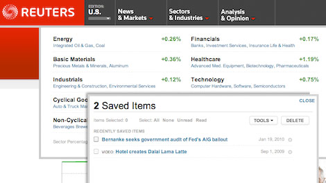
Continuing on the path of desktop/web app convergence, smart navigation and taskbars will dynamically shape the user experience. Smart navigation consolidates large categories of content and displays meta data to help determine the best path of navigation. Taskbars allow you to seamlessly interact with web content and enable websites to learn your preferences.
Reuters utilizes both to maintain a simple but powerful interface. Mouse over one of the four navigational items and get live market info or news before choosing your next page. The taskbar allows you to save, watch or read specific content or topics like a feedreader.
Text Is The New Image
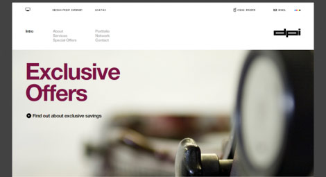
Clever use of typography will continue to gain momentum this year thanks to the original influence of designers like 37signals. The proper use of large and bold typography provides a clean and clear message and can, at times, be more compelling than imagery. In some cases, design will see subtle imagery supporting the typography. When you really need to get your point across, you can’t beat words.
Larger Page Layouts
As monitor size and screen resolution increases so does the real estate for page layout design. This doesn’t mean that we should be laying claim to every available pixel out there. Instead it gives more room for whitespace so designs can present a clear message.
My Trend Wish List
Here are a few items I see when I look into my crystal ball. That doesn’t mean they will happen, but here’s to hoping.
Mobile Version Of Every Website
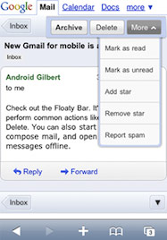
It’s great that today’s smartphones can view webpages in their standard web format, however, it’s just not an optimal experience for most websites due to screen size. I think all websites should auto-format based on the viewing device. Gmail, Facebook and Amazon have already taken on this standard. There are great tools out there such as Mobify that enable easy and inexpensive ways to achieve this. I believe that this will lead to more design agencies specializing in only the mobile format.
eCommerce Tweaker Shopping
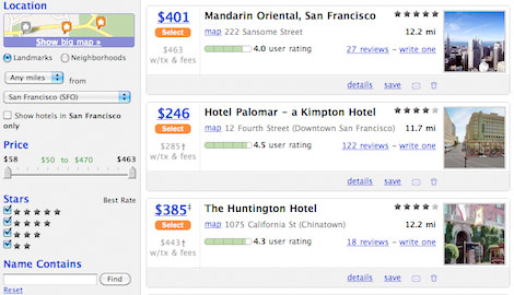
Live search and filtering powered by AJAX have been present for some time in websites like kayak.com or Google Suggest. However, there are still many verticals that have not yet adapted this intuitive selection process. eCommerce websites should give users control of their shopping experience by allowing them to tweak their search results based on their preferences - color, price, social graph, size, features…etc. Right now, sites like Amazon force users to browse all results based on category or search term and then sort.They give users static results that equire additional searching or copious browsing to refine. The browsing aspect of an online store can be changed to a tweak by implementing AJAX sliders, checkboxes and other filtering inputs that enable the user to narrow down the results that suit them best. Users would spend their time tweaking a large pool of products to find the one that fits all their criteria instead of having to examine each product individually or use product comparison engines.
Smart Forms
Other than eCommerce sales, forms are the number one source of user action on the web. The more intelligent and user-friendly forms become, the better results of their conversions. Forms will continue to be more customized to user input. Forms already feature a lot of on the fly validation to correct errors such as improperly formatted email addresses before submittal. I believe that forms should continue to evolve and adapt to user input. Expect to see forms add, change or remove fields based on certain types of input such as gender, age or preference. This allows the website to better cater to the needs and experience of the user and gather more appropriate information. It should also reduce form bounce rates as they are more customized to the user type.


Comments[ 0 ]
Post a Comment