
Home » Archives for April 2007
The Web Design Survey, 2007
Designers, developers, project managers. Writers and editors. Information architects and usability specialists. People who make websites have been at it for more than a dozen years, yet almost nothing is known, statistically, about our profession. Who are we? Where do we live? What are our titles, our skills, our educational backgrounds? Where and with whom do we work? What do we earn? What do we value?
It’s time we learned the answers to these and other questions about web design. And nobody is better qualified than the readers of A List Apart to provide the answers. Participate in our first annual survey to increase knowledge of web design and boost respect for the profession. Selected participants, chosen by random drawing, will win one free ticket to An Event Apart event held in the continental U.S.; an Apple 30GB video iPod, an Event Apart jump drive
Depending on how you answer it, the survey has up to 37 questions, nearly all of them multiple choice. A fluent English speaker should be able to complete the survey in ten minutes or less. Hosted by An Event Apart, the survey will remain open until 22 May, 2007. After we close it, we’ll slice and dice the data and present our findings here.
Think our survey sucks? Do we ask the wrong questions or omit important issues? Discuss the survey to help us make next year’s questions even better. (Note: the software that powers our survey generates id attributes that begin with numbers instead of letters—an XHTML no-no. Because of this behavior of the software, our survey currently does not validate. We’re working to resolve this problem.)
What’s in my menubar?
Seems like every time another Mac user looks over my shoulder, they freak out over the number of little icons I have up in my menubar. And — like all Mac geeks — we have to immediately start trading information, learning tricks, and sharing tips. I’m sure you know the drill by now.
If you were looking over my shoulder right now (and I hope that you are not) here’s the stuff you’d see in my menubar.
The larger version on the Flickr will, where appropriate, let you mouseover for the name and a link, but I’ll save you the trouble of a click by repeating the links below.
- Adium - excellent IM app
- Skitch - Beta of a mind-blowing screen capture app
- Twitterrific - Gives me my Twitter crack
- iScrobbler - Relays my “now playing” info to Last.fm
- quicksilver - Duh. It’s Quicksilver
- Spirited Away - Handy app that hides non-active apps. As seen in my MacBreak demo. Would benefit from an update to Universal Binary
- ChronoSync - Very cool app for keeping two folders synced
- Growl - Notifications out the booty (personally, I like “Music Video” style notifications)
- SynergyKM - App to let you share a keyboard and mouse between multiple computers. Haven’t gotten it working yet, but I plan to.
- Remote Desktop - Control one Mac from another Mac.
- Apple .Mac Sync - Almost-saving grace of the overpriced and underpowered .Mac suite is automatic syncing of iCal, Mail, contacts, etc.
- SoundSource - Free app for changing sound inputs and outputs (highly recommended for musicians and podcasters)
- Spotlight - It’s a piece of crap, but it’s our piece of crap. I tend to use the Quicksilver plug-in more often.
Why Do Intelligent Internet Entrepreneurs Get Involved in Such Sleazy Stuff?
Have you ever met a fairly smart person and then watch their activities in business and just wanted to puke? It certainly gives entrepreneurship a bad name. Indeed, it makes me sick to my stomach. Why do they stoop so low? Well it appears that they do it because it works and that there is a sucker born every minute and rather than having a little integrity and ethics they simply get down to the lowest common denominator and take peoples money.
But why do they do it; that is to say; Why Do Intelligent Internet Entrepreneurs Get Involved in Such Sleazy Stuff? I know for a fact that they do not have too, they are smart enough to figure out a better way and yet will not? It is such a shame to see bright people do this and it makes all business people look bad. It puts a tarnished image on the business community and makes an already skeptical public even more weary. And some of the hype marketing out there is utterly ridiculous.
My theory is that folks are just lazy, both rich and poor, smart or foolish; humans are just trying to get by with minimal effort. It is amazing anyone would want to have a human as an associate or friend. I certainly hope this article is of interest and that is has propelled thought. The goal is simple; to help you in your quest to be the best in 2007. I thank you for reading my many articles on diverse subjects, which interest you.
SEO Guidelines for Website
Designing
1. Every page should be reachable from at least one static text link.
2. Java script and CSS should be defined in a separate file.
3. Avoid toggle
4. Remove unnecessary spaces
5. Use instead of
6. Linking level should not be exceeding more than 3 levels.
7. Try to avoid nested tables/Div, DIV based website is best as per SEO point of view. Search engines can easily crawl DIV based site.
8. Review and remove Hidden text or hidden links. (Due to CSS sometimes it happens by mistake).
9. Links should be properly working. Remove 404 error links.
10. Use colors to distinguish Visited and Unvisited colors
11. Avoid pop ups
12. Maintain Uniformity throughout the website.
Development
1. Java script should be in separate file.
2. Try to reduce code by using functions and include files.
3. Database should be optimized. (To load pages faster, we can decrease response time).
4. Allow search bots to crawl your sites without session IDs or arguments that track their path through the site. These techniques are useful fortracking individual user behavior, but the access pattern of bots is entirely different. Using these techniques may result in incomplete indexing of your site, as bots may not be able to eliminate URLs that look different but actually point to the same page.
Content Writer
1. Content should be Original and unique content of genuine value.
2. Think about the words users would type to find your pages, and includes
those words within it.
2. Think about the words users would type to find your pages, and includes
those words within it.
Server Administration
Technical Server Side Factors:
Technical Server Side Factors:
1. Make sure your web server supports the If-Modified-Since HTTP header.This feature allows your web server to tell Google whether your content has changed since we last crawled your site. Supporting this feature saves you bandwidth and overhead.
2. Remove URL Canoncalization by using 301 Permanent redirection. (http://abc.com and http://www.abc.com) both are different URL’s in the eye of the search engines.
2. Remove URL Canoncalization by using 301 Permanent redirection. (http://abc.com and http://www.abc.com) both are different URL’s in the eye of the search engines.
3. Steps for switching hosting or changing IP:
a) Bring a copy of your site up at the new IP address.
b) Update your name server to point to the new IP address.
c) Once you see search engine spiders fetch pages from the new IP address (typically within 24-48 hours), it's safe to take down the copy of your site at the old IP address.
a) Bring a copy of your site up at the new IP address.
b) Update your name server to point to the new IP address.
c) Once you see search engine spiders fetch pages from the new IP address (typically within 24-48 hours), it's safe to take down the copy of your site at the old IP address.
Click Usability & Accessibility
An overview of what impaired users encounter when using in accessible websites.
Read more…
Google - Click Privacy
Three public-interest groups are expected to file a joint complaint on Friday with the Federal Trade Commission calling for an investigation into the potential threat to consumer privacy posed by Google's planned acquisition of DoubleClick.
The Washington-based Electronic Privacy Information Center (EPIC), along with the Center for Digital Democracy (CDD) and the U.S. Public Interest Research Groups (U.S. PIRG), are asking the FTC to stop the $3.1 billion merger until the trade commission investigates Google's data collection and storage practices, orders DoubleClick to sweep out its data storehouse and requires the search giant to offer a public plan for safeguarding consumer privacy.
Collection of useful resources
PlotKit - Javascript Chart Plotting
JavaScript library for creating graphs. [via Hackszine]
JavaScript library for creating graphs. [via Hackszine]
phpMyID
A single script for hosting your own single OpenID identity. Easy to set up with Apache. (IIS with ISAPI_rewrite, hard.) Supports the sreg extension.
OpenID Enabled: Simple Registration Extension
Here's the "sreg stuff" for OpenID. Avatars aren't mentioned in the spec.
Pavatar - Recognize me!
Avatar auto-discovery standard. Seems like a natural fit with OpenID. This should be added to the optional sreg stuff.
Vitamin Features: Serving JavaScript Fast
Cal on caching, chunking, compression, and integrating all of the above with a workflow
Cal on caching, chunking, compression, and integrating all of the above with a workflow
User Script Compiler
Turn any Greasemonkey script into a full-on Firefox extension (Add-On). [via Spun]
PodCorps: Recording Spoken-Word Events Worldwide
Doug Kaye's latest venture.
Doug Kaye's PodCorps launches today
Jon Udell on public-service podcasting. Excellent ideas here. "This isn't podcasting to build audiences and 'monetize' downloads. It's podcasting to expand access to public discussion."
Reflection.js
A bit of JavaScript that creates image reflections a la coverflow. Trendy!
Chatting with the father of the permalink MetaTalk
Matt and Jessamyn interviewed me for the MeFi podcast.
A bit of JavaScript that creates image reflections a la coverflow. Trendy!
Chatting with the father of the permalink MetaTalk
Matt and Jessamyn interviewed me for the MeFi podcast.
Call Recorder for Skype
For the "podcast someday" list of tools: this will automatically Record Skype Calls On Your Mac
For the "podcast someday" list of tools: this will automatically Record Skype Calls On Your Mac
Resizeable Form Fields
Firefox Add-on lets you click and drag any form field to resize. (Unfortunately, it doesn't remember your field size preference.)
Firefox Add-on lets you click and drag any form field to resize. (Unfortunately, it doesn't remember your field size preference.)
CoRD
Open source remote desktop client for Windows RDC on Mac OS X. Handy if you need to manage Windows servers from Mac. I hear it's more stable than the official Microsoft RDC client for Macs.
Open source remote desktop client for Windows RDC on Mac OS X. Handy if you need to manage Windows servers from Mac. I hear it's more stable than the official Microsoft RDC client for Macs.
Twitter and Jott Vulnerable to SMS and Caller ID Spoofing
If you associate your twitter account with your cell phone--your account is only as secure as your cell phone number.
If you associate your twitter account with your cell phone--your account is only as secure as your cell phone number.
HTML Purifier
PHP code for validating/filtering HTML input.
PHP code for validating/filtering HTML input.
Grant Execute to all Stored Procedures
handy stored procedure for SQL Server that might save your wrists someday.
handy stored procedure for SQL Server that might save your wrists someday.
Tutorial Ninjas - Hacking the Apple TV
Nice step by step guide to getting 3rd party apps running on aTV.
Nice step by step guide to getting 3rd party apps running on aTV.
YouTube - Video explains the world's most important 6-sec drum loop
the history of the "amen break", its impact on culture, and some thoughts about copyright in the sampling age.
the history of the "amen break", its impact on culture, and some thoughts about copyright in the sampling age.
Celsias: Bee Colony Collapse Disorder - Where is it Heading?
A round-up of articles about the honey bee problem that could hurt crops like apples and almonds this year. [via krazydad]
A round-up of articles about the honey bee problem that could hurt crops like apples and almonds this year. [via krazydad]
Don't be a hero: Giving up is good
Everyone wants to be a hero. Techies especially so. And there are special occasions where true glory awaits the hero. When there’s a crisis, it can pay to just carry on no matter what. Get the problem solved and celebrate victory. Winning through shear effort.
But most days are not like that. Most features need not heroes. They need realists. People who are willing to give up and walk away. Being a hero is all about sitting aside all costs and winning anyway. That’s not a prudent way to drive everyday development.
Here’s the problem: You agree that feature X can be done in two hours. But four hours into it, you’re still only a quarter of the way done. The natural instinct is to think “but I can’t give up now, I’ve already spent four hours on this!”.
So you go into hero mode. Determined to make this work, but also embarrassed that it isn’t already so. So the hero grabs his hermit cape and isolates himself from feedback. “I really need to get this done, so I’ll turn off IM, Campfire, email, and more for now”. And some times that works. Throwing sheer effort at the problem to get it done.
But was it worth it? Probably not. The feature was deemed valuable at a cost of two hours, not sixteen. Sixteen hours of work could have gotten four other things done that individually were at least as important. And you had to cut the feedback loop to avoid feeling too much shame, which is never a good thing to do.
That’s where the concept of sunk cost gives us a guide on what to do. It doesn’t what you’ve already spent. That time and money is gone. It only matters whether spending what’s left is worth it or not. Business school 101, but one of the hardest lessons to internalize.
In other words, stop being so afraid of calling it quits. You’re playing to win the full season, not a single game. Every time you play the hero card, you’re jeopardizing the next game.
Heroics are for when you have no other choice. When you can afford to take on tremendous risk because there’s no alternative. That’s probably not today.
Read more…
But most days are not like that. Most features need not heroes. They need realists. People who are willing to give up and walk away. Being a hero is all about sitting aside all costs and winning anyway. That’s not a prudent way to drive everyday development.
Here’s the problem: You agree that feature X can be done in two hours. But four hours into it, you’re still only a quarter of the way done. The natural instinct is to think “but I can’t give up now, I’ve already spent four hours on this!”.
So you go into hero mode. Determined to make this work, but also embarrassed that it isn’t already so. So the hero grabs his hermit cape and isolates himself from feedback. “I really need to get this done, so I’ll turn off IM, Campfire, email, and more for now”. And some times that works. Throwing sheer effort at the problem to get it done.
But was it worth it? Probably not. The feature was deemed valuable at a cost of two hours, not sixteen. Sixteen hours of work could have gotten four other things done that individually were at least as important. And you had to cut the feedback loop to avoid feeling too much shame, which is never a good thing to do.
That’s where the concept of sunk cost gives us a guide on what to do. It doesn’t what you’ve already spent. That time and money is gone. It only matters whether spending what’s left is worth it or not. Business school 101, but one of the hardest lessons to internalize.
In other words, stop being so afraid of calling it quits. You’re playing to win the full season, not a single game. Every time you play the hero card, you’re jeopardizing the next game.
Heroics are for when you have no other choice. When you can afford to take on tremendous risk because there’s no alternative. That’s probably not today.
Blinksale Send Invoice Online
Blinksale is perfect for anyone who needs to invoice clients for services or products sold. Blinksale is an excellent choice for attorneys, accountants, designers, IT professionals, software developers, journalists, contractors, engineers, architects, videographers, and more. Basically, if you need to send invoices, Blinksale can work for you.
Read more…
MySpace takes on Google News and Digg
MySpace is going into the news business with a service that will scour the internet for news stories and let users vote on which ones receive the most exposure.
This approach blends elements of Google News and sites such as Digg and Netscape, which rely on readers to submit stories and determine their prominence. It also marks the site’s ambitions to become a web portal like Yahoo!, providing its users with a front door to the internet.
MySpace, which is owned by News Corp, also the parent company of Times Online, will display headlines from external new sites, a practice that attracted legal challenges when Google used it for its news service.
The search engine recently reached a settlement with Agence France-Presse after the news agency claimed that Google had infringed its copyright.
Dan Strauss, who headed the group that developed MySpace News, said that publishers would be able to opt out of the service if they didn’t want their stories to appear on it. He also said that media outlets owned by News Corp would not receive favourable treatment.
The feature, which is expected to be launched as a ‘beta’ test feature, uses technology developed by Newroo, which News Corp bought last year.
The feature, which is expected to be launched as a ‘beta’ test feature, uses technology developed by Newroo, which News Corp bought last year.
Froogle dumped for Hot Babe
Froogle has been renamed “Google Product Search” says Marissa Mayer, Google’s VP of Search & User Experience. It also sports a redesign, and product results are now returned at the top of normal Google search results at appropriate times.
Thus ends the name Froogle as a Google brand. It was launched in 2002, never really went anywhere, and was unceremoniously dumped from the Google home page last year in favor of video search. Traffic to the site fell dramatically.
Read more…
Thus ends the name Froogle as a Google brand. It was launched in 2002, never really went anywhere, and was unceremoniously dumped from the Google home page last year in favor of video search. Traffic to the site fell dramatically.
StumbleUpon and Google's StumbleUpon clone
Just as StumbleUpon (a popular toolbar that recommends web pages) is rumored to have been acquired by eBay (congrats, Garrett!), Google personalization guru Sep Kamvar announces a similar feature integrated into the Google Toolbar.
StumbleUpon recommends web pages based on pages you explicitly rate while the Google Toolbar recommendation feature learns from the implicit information in your Google search history to determine what kinds of web pages you seem to like. In my usage, both return a lot of misses and some hits, enough hits to be fun and occasionally useful exploration tools.
Read more…
StumbleUpon recommends web pages based on pages you explicitly rate while the Google Toolbar recommendation feature learns from the implicit information in your Google search history to determine what kinds of web pages you seem to like. In my usage, both return a lot of misses and some hits, enough hits to be fun and occasionally useful exploration tools.
~Difference between Microsoft 1.0 and Microsoft 2.0~
~~~~~~~~~~~~~~~~~~~~~~~~~~~~~~~~~~~~~~~~~~~~~~~~~~~~~~~~~~~
Read more…
Today there is some talk about Google creating a new feature for their Google Toolbar which is a personal attack against StumbleUpon. I don't agree with this argument. It's not the exact same thing. But more importantly this new feature just gives Google more and more information about you. I wonder if sites that use Adsense or Adwords will get more dice rolls than others?
If we look at Microsoft back in the 80's and early 90's, they would look at what their competition was doing, and then incorporate that into the next release of their software. Google is doing the exact same thing. BUT. Yes, there is a BUT.
In the Microsoft 1.0 time, it was different. Software took months or years to get out so implementing these changes took time. With Microsoft 2.0 (Google), it can take mere minutes to create the same technology. In the case of this new Toolbar feature, once they complete the development and testing, they can roll it out immediately and have users on the new version within seconds. Not the same for old Microsoft 1.0.
Can we blame Google for doing this? Nope, it's what any smart company would do. If you can't buy your competitors, why not just outbuild them? Remember that shareholders don't care about people. Just the returns. You need to make sure your startup is always one step ahead.
~~~~~~~~~~~~~~~~~~~~~~~~~~~~~~~~~~~~~~~~~~~~~~~~~~~~~~~~~~~
Google 411 from Google Labs
Right after Microsoft acquired TellMe, Google Labs has launched a local search using voice recognition at 1-800-GOOG-411.
In my tests, Google Voice Local Search worked fairly well, good enough that I intend to use it for most local searches from my cell phone. Others report more mixed results.
Some of the reaction to to this has been interesting. Paul Kedrosky says, "Google just killed the directory assistance business," a statement that probably gives too much credit to Google, but may accurately describe the long-term trend.
Tim O'Reilly mentions Googler Peter Norvig's love for big data and wonders if this is "designed to harvest voice data to build Google's own speech database" to create a "competitive advantage in speech recognition."
Probably true, but I doubt that is their primary motivation. Rather, I suspect they are trying to work around the UI problems of search on mobile devices.I am convinced that the long-term success of mobile search will require overcoming the issue of the tiny screens on cell phones and other mobile devices.
While there are a few promising paths to manage with the small screens -- including Patrick Baudisch's clever UI work at Microsoft Research, search personalization to display only the most relevant data in the limited space available, or the iPhone's use of the entire surface of the device as a screen -- I am concerned that these approaches may rapidly hit their limits.
Rather, I suspect we will have to replace the tiny screen with something else. One good option is a voice recognition interface like Google Voice Search or the one TellMe has developed. These make the tiny displays unnecessary.
Another approach may be to make the tiny screen a huge screen. The most promising work I have seen here is the Virtual Retinal Display being developed at the HIT Lab at University of Washington. By drawing video images directly on your retina, it replaces tiny displays with a massive one that covers your full field of view.
The constrained input and display on mobile devices cripple the potential of mobile search. Resolving these issues within the form factor of these devices is not trivial. A voice interface, like Google Voice Local Search, may be one of the better solutions.
Understand Microsoft's CloudDB?
It appears that Microsoft is working on a clone of Google's BigTable codenamed Blue/CloudDB.Mary Jo Foley reports that "CloudDB is a file-system-based storage system ... 'Blue' also seems to refer to the query processor that builds on top of the cheap, file-system-based storage enabled by CloudDB."
That sounds quite similar to BigTable, a distributed database built on top of GFS.It seems hard to track down any other information about this effort. I was able to find a microsoft job posting for a senior SDE that says:
Our team is building a geo-distributed, reliable and high performance internet facing service. You will help internal and external partners to realize Microsoft's vision of seamless access to your data - anywhere, anytime, any device.
You will learn about the Blue/CloudDB storage system, you will work on an API definition, solve problems around security and Quality of Service guarantees.
Do you find it fascinating to build a service that is scalable, geo-distributed, has efficient queuing, load balancing? We will solve together problems about performance, reliability and intelligent optimization for different traffic patterns. The product will be used also by internal Windows Live Services and you will have the opportunity to interact with multiple groups in the company that need easy, efficient and simple storage in the cloud.
Join us and help Microsoft go head to head with Amazon, Google, and Yahoo in cloud storage.
From that description, it sounds like Microsoft's CloudDB may be intended to compete with several efforts, including Amazon S3, AOL's XDrive, the Yahoo-supported Hadoop, and Google's BigTable, Google File System, and GDrive.
I am not even sure if it is from Microsoft, but I did also find something that looks like a leak of some pieces of an internal document called "CloudDB Living Spec v0.51.doc". The web page mentions the needs of Microsoft services (including MSN Shopping and Fremont/Expo) and echos terminology used in Google's BigTable paper. Some selected excerpts:
SSTable's efficient data is less than 40%, column name occupy much room in each item. Maybe we should use the column id to reduce this part of overload. Sparse columns baked into the app. This scenario arises when an MSN service defines a large set of potential attributes for a type of an object, but only very few of these attributes are expected to be set on any given object.
For example ... [in] MSN Shopping ... the total set of attributes that products can have (e.g. "Pixel Resolution") is very large, but any given product only has a few (a vacuum cleaner doesn't have 'Pixel Resolution').
[A] service wants to be able to add 'attributes' to people, without having to waste space in every person for every attribute ... The most prominent example of this is Freemont --- this service wants to allow users to add their own columns to their listings. The total number of columns used across all objects can be huge (millions).
Note: Google Base advertises support (and is optimized) for cases where even a single object can have millions of columns.
Google buys PowerPoint editor
Filling in a hole in its Google Apps suite, Google has acquired Tonic Systems, which provides a set of tools for the online editing, viewing, and sharing of presentations created with Microsoft PowerPoint. Tonic Systems describes itself as "Java PowerPoint Specialists." Google says it will incorporate Tonic's technology into a new presentation service that will be added this summer to Apps.
Tonic's TonicPoint tools allow you to open a PowerPoint presentation with your web browser, edit it, add new slides to it, extract text and images from it, and save the edited version in various formats. What makes TonicPoint particularly interesting, in the context of Google's ambitions, is that you don't have to have a copy of PowerPoint installed on your PC to open and edit a PowerPoint file with the tools. You only need the file. You can, effectively, work in a Microsoft app without buying the Microsoft app.
As with Google Docs and Google Spreadsheets, Google seems to be designing Google Presentations as a hybrid complement/competitor to Microsoft's Office applications. You first use them as add-on tools for manipulating and sharing Microsoft files online, and then, eventually, you find that you don't need the underlying applications anymore. Google Apps, in other words, is designed not as an Office Killer but rather as a kind of Office Bodysnatcher. Google doesn't want to fight the Microsoft apps head-on. It wants to get inside them, and slowly take them over.
Google has wiped the Tonic Systems' web site clean, but, for the moment, a demo of the service is still running here. (Update: It's gone.) Here are some screen shots:


Website Usability Roles and Definitions
What is the Definitions and Roles of Usability?
Read more…
- efficiency with which a user can perform required tasks with a product, for example, a website. Usability can be measured objectively via performance errors and productivity, and subjectively via user preferences and interface characteristics. Web design features that affect usability include navigation design and content layout.
- That quality of a system that makes it easy to learn, easy to use and encourages the user to regard the system as a positive help in getting the job done. User A person who uses a system to perform a business function.
- Usability is a multidimensional attribute that relates to the impact a product has on its end-users. In general it refers to the efficiency with which a customer can do their tasks with the product, and their overall satisfaction with that process. Usability should be considered from a systems perspective including the hardware and software interfaces, the documentation, packaging, and any other component of the system and processes surrounding it that affects the user
- Usability is about building web sites based on user feedback and input and with the users' needs and goals in mind. We want to reduce confusion and make it easier for users to accomplish their goals on the site. Usability is a very complex area that employs many techniques and ideas but the goal is rather straightforward. The payoff is in lower support costs and a better user experience.
The IT Factor
What is the current role of IT? A quick Google search gives us a few options:
Read more…
- Includes all matters concerned with the furtherance of computer science and technology and with the design, development, installation, and implementation of information systems and applications;
- a term that encompasses all forms of technology used to create, store, exchange and utilize information in its various forms including business data, conversations, still images, motion pictures and multimedia presentations;
- Information technology provides the "engine" used to drive useful information systems. This includes computers, software, Internet/Intranet and telecommunications technology.
- The term "IT" encompasses the methods and techniques used in information handling and retrieval by automatic means. The means include computers, telecommunications and office systems or any combination of these elements.
- The technology of computers, telecommunications, and other devices that integrate data, equipment, personnel, and problem-solving methods in planning and controlling business activities. Information technology provides the means for collecting, storing, encoding, processing, analyzing, transmitting, receiving, and printing text, audio, or video information. Hardware: In the context of information technology, the computer and its peripherals constitute the hardware. ...
- Information technology (IT) or information and communication technology (ICT) is the technology required for information processing. In particular the use of electronic computers and computer software to convert, store, protect, process, transmit, and retrieve information from anywhere, anytime.
The list goes on of course. Picking out recurring themes, we see IT defined as the 'engine' driving a corporations technological advantage, the means to automate repetitive functions and even the key to an organization's profitability and productivity.
I think everyone would agree with these definitions as the genesis of IT, but what we see today reminds me a lot of Cheetahs. Yes, the fastest mammals on earth. If a corporation needs to attack millions of database records and view the results in a nice report, they can often do so in record time - certainly compared to their corporate forefathers. Most corporate IT departments today are well suited to catching and devouring modern information problems. So much so that among all Fortune 500 IT departments, it may be difficult to tell if anyone enjoys an advantage or not. Uniformity has brought the great ability to move in a single direction at high speed.
But what if the game changes? Not just a permutation of current problems, but an evolutionary lurch of every business problem. How strong is a corporate IT group when today's viable solution providers have been whittled to a mere handful of well-known names. It's a situation not unlike the Cheetah's genetic stock: its very survival is threatened by the lack of variability. For instance, what if the next generation of business winners are selected by their ability to enhance communication - not just within the confines of business firewalls among colleagues, but outside the firewall with anybody that can provide an advantage? Furthermore, such choices in communication are highly individual. How will this square with IT departments that are trying to centralize every and all technology.
Google Acquire DoubleClick
Google Inc. announced today a definitive agreement to acquire DoubleClick Inc., a global leader in digital marketing technology and services, for $3.1 billion in cash from San Francisco-based private equity firm Hellman & Friedman along with JMI Equity and management. The acquisition will combine DoubleClick's expertise in ad management technology for media buyers and sellers with Google's leading advertising platform and publisher monetization services.
The combination of Google and DoubleClick will offer superior tools for targeting, serving and analyzing online ads of all types, significantly benefiting customers and consumers:
For users, the combined company will deliver an improved experience on the web, by increasing the relevancy and the quality of the ads they see.
For online publishers, the combination provides access to new advertisers, which creates a powerful opportunity to monetize their inventory more efficiently.
For agencies and advertisers, Google and DoubleClick will provide an easy and efficient way to manage both search and display ads in one place. They will be able to optimize their ad spending across different online media using a common set of metrics.
"It has been our vision to make Internet advertising better - less intrusive, more effective, and more useful. Together with DoubleClick, Google will make the Internet more efficient for end users, advertisers, and publishers," said Sergey Brin, Google's Co-Founder & President, Technology.
"DoubleClick's technology is widely adopted by leading advertisers, publishers and agencies, and the combination of the two companies will accelerate the adoption of Google's innovative advances in display advertising," said Eric Schmidt, Chief Executive Officer of Google.
"This transaction will strengthen our advertising network by expanding our access to publisher inventory and enabling us to serve the needs of a broader set of advertisers and ad agencies," said Tim Armstrong, Google's President, Advertising and Commerce, North America.
"Google is the absolute perfect partner for us," said David Rosenblatt, Chief Executive Officer of DoubleClick. "Combining DoubleClick's cutting edge digital solutions for both media buyers and sellers with Google's scale and innovative resources will bring tremendous value to both our employees and clients."
"When we acquired DoubleClick in July 2005, we saw an opportunity to partner with a great management team to further enhance the company's capabilities and growth trajectory," said Philip Hammarskjold, Managing Director of Hellman & Friedman. "This transaction affirms the successful transformation of DoubleClick, positions the firm for the future, and greatly benefits our investors."
Both companies have approved the transaction, which is subject to customary closing conditions, and is expected to close by the end of the year.
Webcast and Conference Call Information
The company will host a conference call and webcast at 2:45 p.m. Pacific Time (5:45 p.m. Eastern Time) today to discuss the acquisition. To access the conference call, please dial 866-288-0543 domestic and 913-312-6664 internationally. A replay of the call will be available until midnight, Friday, April 20, 2007 at 888-203-1112 domestically and 719-457-0820 internationally. Confirmation code for the replay is 8456893. A live audio webcast of the conference call will be available at http://investor.google.com/webcast.html.
About Google Inc.
Google's innovative search technologies connect millions of people around the world with information every day. Founded in 1998 by Stanford Ph.D. students Larry Page and Sergey Brin, Google today is a top web property in all major global markets. Google's targeted advertising program provides businesses of all sizes with measurable results, while enhancing the overall web experience for users. Google is headquartered in Silicon Valley with offices throughout the Americas, Europe and Asia. For more information, visit http://www.google.com/.
About DoubleClick, Inc.
DoubleClick is a provider of digital marketing technology and services. The world's top marketers, publishers and agencies utilize DoubleClick's expertise in ad serving, rich media, video, search and affiliate marketing to help them make the most of the digital medium. From its position at the nerve center of digital marketing, DoubleClick provides superior insights and insider knowledge to its customers. Headquartered in New York, and with 17 offices and development hubs and 15 data centers worldwide, the company employs more than 1200 people and delivers billions of digital communications every day. Learn more at http://www.doubleclick.com/
13 April in History
1598: Edict of Nantes grants political rights to French Huguenots Countdown to the revolution starts
1829: The British Parliament passed the Catholic Emancipation Act, granting freedom of religion
1849: Hungarian Republic proclaimed
1865: Sherman's march through Georgia begins Southerners start promising that the South will rise again
1912: The British Royal Flying Corps (RAF) was created by Royal Charter
1943: FDR dedicates Jefferson Memorial
1960: France becomes the 4th nuclear nation exploding an A-Bomb in Sahara And atom here, an atom there
1970: The American spacecraft Apollo 13, enroute to the Moon, has an onboard explosion
Read more…
1829: The British Parliament passed the Catholic Emancipation Act, granting freedom of religion
1849: Hungarian Republic proclaimed
1865: Sherman's march through Georgia begins Southerners start promising that the South will rise again
1912: The British Royal Flying Corps (RAF) was created by Royal Charter
1943: FDR dedicates Jefferson Memorial
1960: France becomes the 4th nuclear nation exploding an A-Bomb in Sahara And atom here, an atom there
1970: The American spacecraft Apollo 13, enroute to the Moon, has an onboard explosion
MyQuire: Another Social Network
 Looking deeper under the surface you’ll find everything you’re used to. You have your own homepage that you’ll be able to edit at will. It’s split up into sections including, Photos, Tasks, Projects, Friends, the Wall, etc. Each section does essentially what you’d think it would do. Photos allows you to upload pictures from your computer. Your main profile holds all the necessary personal information identifying you, age, relationship status, location, email, even spiritual and political preferences. You have your own inbox on MyQuire that you can send and receive messages from other users. Also on your main page you have the “Wall” which simply allows you to post random comments and ideas that may come to your mind.
You have a projects area where you can create projects and assign members to. In the free plan, I felt it would’ve been nice to allow users to create more than one project to play around with. To add members to a project, simply drag the people you want working on the project from your friends list, onto the desired project. Also, each project is logged into a folder in the “My Hard Drive” section of the website also. This area allows you to manage each of your projects folders. You can open up and revise the files within each of these folders in a WYSIWYG. Easy enough. You can create new files in the hard drive sections and they’ll be stored there and displayed under the “My Files” section on your profile’s front page as well.

The calendar part of MyQuire is probably one of my favorites. It sets you up with a calendar that you are able to add tasks to by day and time. It works very nicely for keeping track of numerous events if your life is a little hectic. You can display them by day, week or month and you can also use the “Subscribe” button to synchronize your MyQuire calendar up with some of the more popular offline calendar applications, including Microsoft Outlook, iCal, and Mozilla Sunbird. The tasks section of the site also has this synchronization feature. Not much to really say about the tasks section though. You create tasks and assign them to a specific due date, if applicable.
While MyQuire doesn’t do anything wrong, it doesn’t do anything really new. We’ve been seeing these networks emerge like dandelions on the internet. One sprouts and soon its ideas fly through the virtual wind and attract others to try and make something similar. I have nothing against MyQuire, it functions, it’s very easy to learn and use, and it covers all the necessary aspects to help people keep themselves organized. Would it be worth upgrading to the Premium plan? I personal wouldn’t, but if it’s your cup of tea, go for it.
While MyQuire doesn’t do anything wrong, it doesn’t do anything really new. We’ve been seeing these networks emerge like dandelions on the internet. One sprouts and soon its ideas fly through the virtual wind and attract others to try and make something similar. I have nothing against MyQuire, it functions, it’s very easy to learn and use, and it covers all the necessary aspects to help people keep themselves organized. Would it be worth upgrading to the Premium plan? I personal wouldn’t, but if it’s your cup of tea, go for it.
Adobe CS3 Shipping Next Monday, April 16
I learned today that Adobe’s date to begin shipping the CS3 Design Premium and CS3 Web Premium suites is Monday, April 16, 2007. As far as I can tell, there’s no word on the CS3 Design Standard or CS3 Web Standard suites.
The CS3 Master Collection, which carries all Adobe CS3 applications, is not scheduled to ship until Sunday, July 15, 2007.
Also: I heard a rumor at Photoshop World that the CS3 Production Premium applications—which include the video applications—will be released for public beta this Monday, April 16 as well. It will be an exciting day for video content creators as well as the rest of us creative pros!
FAQ's about CTS & RSI
What categories of people are more at risk?
As a group, women are more at risk than men. There are several reasons for this. Women tend to do more of the repetitive computer tasks than men do. They also have less muscle mass than men have, and a greater percentage of women fall outside the height range considered the norm. The further you are from the standard, or "average" male that most office furniture was designed for, the more risk you have.
Are there any other factors that should be considered?
Yes, there are also genetic factors. As with many other injuries, some people have a genetic predisposition to getting them. Another factor is how your work at the computer is accomplished during a day. Consider two people doing the same number of keystrokes in the same amount of time at a computer. One sits down for three hours and works nonstop. The other breaks up the work into multiple sessions. The person who does all the work at one time is more at risk for CTS and RSI.
How does repetition fit in?
Think of this like you would some other cumulative-type diseases. It is not one french fry that gives you heart disease, rather it is the cumulative effect over a number of years. The cumulative effect varies in its impact on different people. It is performing the same movement over and over with too much force and/or too awkward a position that starts to add up.
Does everyone have the same risk of Carpal Tunnel Syndromeand Repetitive Stress Injuries?
No, the risk is not the same for everyone. However, there are some categories of computer users who are more at risk than others. Consider the fact that most office furniture is one size fits all. If you lined up computer users in your office, they are going to be all shapes and sizes, yet they all sit at the same standard office furniture whether it fits them or not.
Read more…
As a group, women are more at risk than men. There are several reasons for this. Women tend to do more of the repetitive computer tasks than men do. They also have less muscle mass than men have, and a greater percentage of women fall outside the height range considered the norm. The further you are from the standard, or "average" male that most office furniture was designed for, the more risk you have.
Are there any other factors that should be considered?
Yes, there are also genetic factors. As with many other injuries, some people have a genetic predisposition to getting them. Another factor is how your work at the computer is accomplished during a day. Consider two people doing the same number of keystrokes in the same amount of time at a computer. One sits down for three hours and works nonstop. The other breaks up the work into multiple sessions. The person who does all the work at one time is more at risk for CTS and RSI.
How does repetition fit in?
Think of this like you would some other cumulative-type diseases. It is not one french fry that gives you heart disease, rather it is the cumulative effect over a number of years. The cumulative effect varies in its impact on different people. It is performing the same movement over and over with too much force and/or too awkward a position that starts to add up.
Does everyone have the same risk of Carpal Tunnel Syndromeand Repetitive Stress Injuries?
No, the risk is not the same for everyone. However, there are some categories of computer users who are more at risk than others. Consider the fact that most office furniture is one size fits all. If you lined up computer users in your office, they are going to be all shapes and sizes, yet they all sit at the same standard office furniture whether it fits them or not.
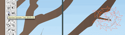
Spraying Symbols in Adobe Illustrator
Say, you want to draw a tree in full Spring, a very green one। Not just an outline you want details too so that you actually see the leafs। Unless you have a ton of time on your hands or you’re paid by the hour, it would be a hell of a job to draw each leaf one by one। This would be one of the many situations where the Symbol Spaying Tool can be of assistance।

Read more…
Step 1 - Create a few symbols to spray with
First of all you need to create a few symbols to have a bit of variation to work with. Instead of creating a symbol of only one leaf, I suggest to draw groups of leaves and make them separate symbols. To do this, just select the group of leaves and drag & drop them in the Symbols palette. I've used different shades of green for my leafs
First of all you need to create a few symbols to have a bit of variation to work with. Instead of creating a symbol of only one leaf, I suggest to draw groups of leaves and make them separate symbols. To do this, just select the group of leaves and drag & drop them in the Symbols palette. I've used different shades of green for my leafs
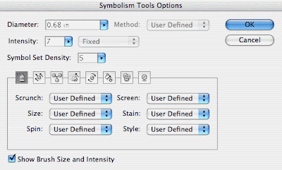
Step 2 - Set the Symbol Sprayer Tool
The second step is to double click the Symbol Sprayer Tool in the Toolbox and adjust the settings to your wishes। This can be a bit tricky and you might need to experiment a bit to find the setting that fits your purpose. I've used an intensity of 7 and a Symbol Set Density of 5. Furthermore I've changed all dropdown menus to "User Defined".
Step 3 - Let the fun begin and spray like you've never sprayed before
Once you've discovered the desired setting you can start spraying around. Oh and you don't have to worry about damaging the ozone layer here, you can spray like a madman :) Just click and drag, release the mouse when you think that there are enough leaves. I usually deselect each time I've released the mouse. This way you have all separate sprayings, so you can move them around and rearrange them a bit if needed.
 Don't stop experimenting
 If you're still not satisfied with the result, you can also tweak a bit by using the Symbol Shifter, Cruncher, Sizer, Spinner, Stainer, Screener or Styler Tool. These tools are hidden under the Symbol Sprayer Tool when you select and hold down the mouse. Think about the possibilities here in this tool and the amount of time you can save: a field full of flowers, a sky full of birds,... Ah Spring, can't wait till it's here. The weather forecast isn't looking that bad for this week.
The second step is to double click the Symbol Sprayer Tool in the Toolbox and adjust the settings to your wishes। This can be a bit tricky and you might need to experiment a bit to find the setting that fits your purpose. I've used an intensity of 7 and a Symbol Set Density of 5. Furthermore I've changed all dropdown menus to "User Defined".
Step 3 - Let the fun begin and spray like you've never sprayed before
Once you've discovered the desired setting you can start spraying around. Oh and you don't have to worry about damaging the ozone layer here, you can spray like a madman :) Just click and drag, release the mouse when you think that there are enough leaves. I usually deselect each time I've released the mouse. This way you have all separate sprayings, so you can move them around and rearrange them a bit if needed.
Don't stop experimenting If you're still not satisfied with the result, you can also tweak a bit by using the Symbol Shifter, Cruncher, Sizer, Spinner, Stainer, Screener or Styler Tool. These tools are hidden under the Symbol Sprayer Tool when you select and hold down the mouse. Think about the possibilities here in this tool and the amount of time you can save: a field full of flowers, a sky full of birds,... Ah Spring, can't wait till it's here. The weather forecast isn't looking that bad for this week.
Making your business cards dynamic in Illustrator
Do you often have to create a page filled with the same business cards, stickers etc। nicely arranged ready to go to the printer? You know you don’t have to copy and drag them “manually” on the page. There is a much smarter way of doing this…
Step 1 - Create your business card and group all objects
First create your business card with crop marks and everything all set When finished group all objects
Step 1 - Create your business card and group all objects
First create your business card with crop marks and everything all set When finished group all objects
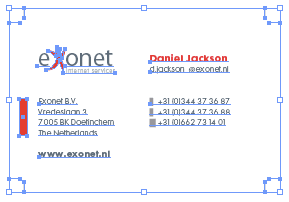
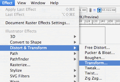
Step 2 - Apply a Transform Effect
Select your business card and go to the Effects menu। Go to Distort & Transform and choose Transform. Check the Preview option so you see the effect live. Enter 3 in the copies field, -65 mm in the vertical field under the Move option. So we're duplicating the card 2 times under each other.

Step 3 - Apply a 2nd Transform Effect on top
Now, we're going to add a 2nd effect on top of this one to have this column duplicated to the right. With the original card still selected, go to the Transform effect again and ignore the alert message box, because normally you don't go to the same effect twice. You use the Appearance Palette instead and edit from there. In this case however, we ignore the warning and click "Apply New Effect". Enter 1 in the copies field and make sure Preview is checked again so you see what happens. Enter 92 mm in the horizontal field under the Move option. Woohoo! Look at that! A whole page of cards! But wait, it's not done yet :)
Step 4 - Watch the magic
Now, just to show it's magic and power, edit the name of the business card or any other data। All cards are updated automatically! Cool isn't it? If you want to move the cards. It'll move all duplicates as well, that's also very handy.
Step 5 - Create a Graphic Style for later reuse
There is more magic to show। Select the card again and drag it into the Graphic Styles palette. You've now created a style that you can apply to any other business card with the same dimensions. If you create a new card, group all objects, select the new card and select this new style you've just created in the Graphic Styles palette, it'll automatically duplicate your new card and create a full sheet of cards! What a time safer that is! :)
I've used this technique a lot for stickers and business cards and it has saved me a lot of time instead of duplicating them "manually".
All credits of this article go to Collin Smith from Adobe। To my knowledge he invented this technique a few years back. This technique works in version CS or later.
Photoshop CS3 Public Beta Launch
For the first time in history, Adobe has released a public beta of it’s flagship product, Photoshop. Photoshop CS3 has been released as a public beta mainly to provide native support for Mac based Intel chips for Adobe Photoshop CS2 customers according to Adobe sources.
The Windows version of the beta will also be available for download. To run the beta all you need is a valid CS2 serial number which will last until after the final product ships (Officially around Spring ‘07). If you don’t have a CS2 serial number the beta will expire in 2 days.
The Windows version of the beta will also be available for download. To run the beta all you need is a valid CS2 serial number which will last until after the final product ships (Officially around Spring ‘07). If you don’t have a CS2 serial number the beta will expire in 2 days.
Adobe stresses that CS2 is still the current shipping version and CS3 is offered as a beta only with no support or warranties of stability.
Top Mistakes in Web Design
1.Bad Search
Overly literal search engines reduce usability in that they're unable to handle typos, plurals, hyphens, and other variants of the query terms. Such search engines are particularly difficult for elderly users, but they hurt everybody.
A related problem is when search engines prioritize results purely on the basis of how many query terms they contain, rather than on each document's importance. Much better if your search engine calls out "best bets" at the top of the list -- especially for important queries, such as the names of your products.
Search is the user's lifeline when navigation fails. Even though advanced search can sometimes help, simple search usually works best, and search should be presented as a simple box, since that's what users are looking for.
2. PDF Files for Online Reading
Users hate coming across a PDF file while browsing, because it breaks their flow. Even simple things like printing or saving documents are difficult because standard browser commands don't work. Layouts are often optimized for a sheet of paper, which rarely matches the size of the user's browser window. Bye-bye smooth scrolling. Hello tiny fonts.
Worst of all, PDF is an undifferentiated blob of content that's hard to navigate.
PDF is great for printing and for distributing manuals and other big documents that need to be printed. Reserve it for this purpose and convert any information that needs to be browsed or read on the screen into real web pages.
3. Not Changing the Color of Visited Links
A good grasp of past navigation helps you understand your current location, since it's the culmination of your journey. Knowing your past and present locations in turn makes it easier to decide where to go next. Links are a key factor in this navigation process. Users can exclude links that proved fruitless in their earlier visits. Conversely, they might revisit links they found helpful in the past.
Most important, knowing which pages they've already visited frees users from unintentionally revisiting the same pages over and over again.
These benefits only accrue under one important assumption: that users can tell the difference between visited and unvisited links because the site shows them in different colors. When visited links don't change color, users exhibit more navigational disorientation in usability testing and unintentionally revisit the same pages repeatedly.
4. Non-Scannable Text
A wall of text is deadly for an interactive experience. Intimidating. Boring. Painful to read.
Write for online, not print. To draw users into the text and support scannability, use well-documented tricks:
Write for online, not print. To draw users into the text and support scannability, use well-documented tricks:
- subheads
- bulleted lists
- highlighted keywords
- short paragraphs
- the inverted pyramid
- a simple writing style, and
- de-fluffed language devoid of marketese.
5. Fixed Font Size
CSS style sheets unfortunately give websites the power to disable a Web browser's "change font size" button and specify a fixed font size. About 95% of the time, this fixed size is tiny, reducing readability significantly for most people over the age of 40.
Respect the user's preferences and let them resize text as needed. Also, specify font sizes in relative terms -- not as an absolute number of pixels.
6. Page Titles With Low Search Engine Visibility
Search is the most important way users discover websites. Search is also one of the most important ways users find their way around individual websites. The humble page title is your main tool to attract new visitors from search listings and to help your existing users to locate the specific pages that they need.
Choosing An Effective Website Colour Combination
An aesthetically pleasing colour scheme can make or break your website। After all, in advertising, colour accounts for 60% of advertisement's acceptance or rejection. Therefore, colour plays a pivotal role in determining whether or not a potential customer will choose to conduct business with your firm. A web designer needs to ensure that all of your website’s colours work in harmony, while keeping the client’s identity consistent with other marketing efforts.
Quick Rules of Thumb
Quick Rules of Thumb
- Stick to 3 to 5 colours when planning a website
- When in doubt, use white for the background colour, and black for the text कलर
Using Your Company’s Logo Colours
If your company already has a logo designed by a professional – great! This is the best starting point for choosing your website’s colour combination। You may choose to use the exact colours found in your logo, or even add some complimentary colours. But, it is important not to stray too far from your logo’s colour scheme in order to keep your company’s identity consistent.
Colour Defines Mood
The colours of your website are important because they can elicit different emotions from your visitors. Colours can make us happy, excited, angry or sad. Below is a list of colours along with the corresponding moods which they evoke:
Warm Colors
Red: aggressiveness, passion, strength, vitality
Pink: femininity, innocence, softness, health
Orange: fun, cheeriness, warm exuberance
Yellow: positive thinking, sunshine, cowardice
Cool Colors
Green: tranquility, health, freshness
Blue: authority, dignity, security, faithfulness
Purple: sophistication, spirituality, costliness, royalty, mystery
Neutral Colors
Brown: utility, earthiness, woodiness, subtle richness
White: purity, truthfulness, being contemporary and refined
Gray: somberness, authority, practicality, corporate mentality
Black: seriousness, distinctiveness, boldness, being classic
Choosing a Color Scheme
Once you understand the colours and their connotations, the next step is to choose a colour scheme for your website. Below is list of different types of colour combinations:
Monochromatic colour combinations use a single color. Variations in lightness of the selected colour can be used to create the sense of different colours. Monochromatic colors go well together, producing a soothing effect, and are very easy on the eyes. The drawback however, is that, it can be difficult to highlight the most important elements on your website.
Analogous color schemes use colours that are related, but not the identical, to create visually attractive combinations. Choosing this type of colour scheme is accomplished by picking colours that are close to each other on the colour wheel. For example, a selection of blues and purples, or reds and oranges would make a good analogous combination. One colour must be picked as the dominant colour while the others are used as accents.
Complementary (or contrasting) color schemes are comprised of 2 colours that are opposite each other on the color wheel. This combination is most appealing when a warm and a cool colour are used. For example, red with green or blue work well as contrasting colours. Using one colour for your background, and its complementary color to highlight key elements will give you colour dominance and colour contrast. One word of caution: it is difficult for the human eye to focus on contrasting colours at the same time. Therefore, it is best to avoid using strong contrasts for background and text colours.
AJAX Frameworks: Mixing Dojo & DWR
Right now is complex to determine which AJAX (Asynchronous JavaScript And XML) framework is the right choice for a project. This is it because AJAX is a complex mix of different scenarios and technologies. So when looking to the various options available it's important to understand where do they can be best applied. Currently there's a course over Java Passion that has a lesson dedicated to this. In summary these are the things to understand:
- AJAX is composed of client side technologies (Javascript), server side technologies and XML requests
- On the client side, one should ask for a library that facilitates the work with Javascript (provides an abstraction layer), has a rich widget set, manages the communications and, really important, is browser independent
- On the server side the choices are limited by other constraints. At least, the selected option should offer a good integration with your web framework and handle the low level incoming requests
- Both sides of the equation should be in equilibrium, that is, you have to bridge the gap between client and server
The available interesting (a personal point of view, there are more) frameworks, usable with Java, are:
- dojo: It can handle everything on the client side and offers a good selection of widgets. It can work with any server side technology. It's the most used Javascript framework probably.
- scriptaculous: The most appealing AJAX widgets I've seen. They are few though.
- Honorable mentions go for DHTML Goodies (nice!) and Rico aswell
- As appointed Yahoo! UI Library is a very well documented and supported client side library. I would endorse it specially for people that find dojo's documentation a little nightmare!
- Looking into the future there's the Sun backed jMaki, a framework to wrap JS widgets in JSP tags (or JSF components). It's still under heavy development but I expect very interesting things to show up this year.
- DWR: It offers a different approach. It's neither client nor server technology but the glue between them. It shows its power managing communications and exposing server code in the browser.
- GWT: want to create your own gmail?
Once known the alternatives an informed decision can be made. I'm gonna stand and recommend something, keep your Java server code untouched (and I would recommend using Spring), select the widget library (dojo this time but you can even mix and match) and glue everything with DWR. The advantages are obvious, the code will work with or without AJAX calls, no extra work is needed to expose the beans and the look&feel is highly improved.I'm quite sure a lot of people are successfully using this scheme lately but I haven't really found a simple tutorial to help beginners. Here's a little example to start. Fortunately, there's not much you need to do. DWR has put a lot of effort to handle the communications and move the logic to the server side. Just rely on it.
CSS tips and tricks
For those of you that are new to CSS or experts always looking for a new trick, here are some of things I do on a regular basis to keep my code organized (kind of).
1. Size text without using pixels
If you’re wondering how some designers get font sizes to work using em as a unit rather than px, it’s easy. There is a trick that was written about a while ago (maybe on ALA) that resets the font sizes for the entire site so that 1.0em is the same as 10px.
1. Size text without using pixels
If you’re wondering how some designers get font sizes to work using em as a unit rather than px, it’s easy. There is a trick that was written about a while ago (maybe on ALA) that resets the font sizes for the entire site so that 1.0em is the same as 10px.
body { font-size: 62.5% }
Simply throw the font-size: 62.5% bit into your body styling and you’re done. Now you can use ems to sizes your fonts rather than pixels.
So your paragraph styles might look something like this:
p { font-size: 1.2em; line-height: 1.5em; }
You might be wondering why it matters how you size fonts? Bulletproof design. Any major site needs to be able to withstand a user enlarging text (old people use the web too!), and setting absolute sizes is not good practice.
2. Make your code easy to read
When I was looking at some of the CSS coded by Rundle I noticed that he separated his heading tags nicely. It looked something like this:
h1 {}
h1#logo { font-size: 2em; color: #000; }
h2 {}
h2.title { font-size: 1.8em; font-weight: normal; }
Quickly scanning the CSS for the different heading tags is a breeze if you use this technique. It is also helpful if you’re sharing code or working on a large site where you are using the same heading tags (say, h2) in multiple places since you’ll be able to style each one independently and not worry about child classes inheriting attributes from the parent class.
I also use similar techniques for paragraph tags, anchor tags, and any other tag that requires multiple classes to look correct in every instance.
3. Separate code into blocks
This might be common sense to some of you but sometimes I look at CSS and it’s not broken down into “sections.” It’s easy to do an it makes working with code weeks, months, or years later much easier. You’ll have an easier time finding classes and elements that you need to change.
This is how I usuall break down my site:
/* Structure */
This is where I’d put the primary site structure divs and classes.
/* Typography */
This is where I would list things like paragraphs, headings, and other miscellaneous font styles such as small and strong tags.
/* Links */
This one is simple - all the styling for anchor tags.
/* Lists, images, etc. */
This is where I would style images, lists, and any other elements that didn’t fit into the rest of the section. If I have an unordered list for the navigation I might setup a new section for navigation and setup all the styles for the navigation, including the list and link styles, in this section - it makes editing the navigation much easier.
4. Stop using so many divs!
This has been echoed by a lot of coders and standards nuts, and while I don’t think there is anything wrong with using a lot of block level elements, I laugh a little when I see someone style their article headlines using a div rather than a heading tag. Some people even style their bylines using a div! Try using the small tag or the a span for goodness sake.
5. Style everything at once
I noticed that I was typing “margin: 0; padding: 0;” in just about every element. I remembered seeing someone use “*” to style everything on a page at once. I decided it didn’t make much sense to define margin and padding over and over when I always gave them the same parameters.
It’s easy to do:*
{ margin: 0; padding: 0; }
Now you only have to define margin and padding on elements where you actually want some.
Know of any other tips or tricks? Let me know :)
Website Accessibility - Proper Navigation
A very important point to consider while designing a website is proper navigation. You must ensure that potential clients or customers are able to find the information they are looking for without too many clicks. As a quick rule of thumb, visitors to your site should be able to visit all your pages by using, at most, 3 clicks. This is also important when considering search engine optimization (SEO) because search engines will only spider (or index) pages that are 3 clicks deep into your site. Not only does proper navigation allow users to find information they are looking for, but it also allows search engines to spider (or index) the information they are looking for. This is essential if you want high quality search engine traffic directed to your website.
Different types of websites employ different navigation styles, so it is probably best to visit websites similar to your own to see which navigation structure they have chosen. The most common locations for your navigation menu are either on the left side of the page or at the top of the page. When internet users view a website, they do so using what is termed as a “Z scan”. As soon as a page loads, most people scan from the top-left, across to the top-right of the page, then down to the lower-left, and eventually across to the lower-right of the page. So, it makes the most sense to locate your navigation menu in the area where the user is going to first look.
Smaller sites usually only require a static menu on either the side or top of the page. However, website that contains 10 – 15 topics on different pages may require a drop-down menu. These menus may use DHTM, JavaScript, or some other programming language. When the user’s mouse moves over a main topic category, boxes containing subcategories will drop-down, allowing the user to quickly find the information they are looking for. I f this type of menu is used, it is best to also include text-based navigation in another location on the page. Older browser versions may not support drop-down menus, and therefore a small percentage of people may not be able to navigate your website. Even more important though, is the fact that search engines will not be able to navigate and index your site if there is no text based navigation.
Another concern is accessibility by assistive technologies. For example, blind Internet users literally read the code of your page. Therefore, if a navigation menu is image based or uses image maps, alternate text must be used to allow the user to properly navigate the website. To make things easy, no matter what type of navigation I choose for a client’s website, I always include text-based navigation links at the bottom of every page to ensure that they are accessible to all Internet users and search engine spiders.
A Few Important Tips
- Plan your site navigation structure before designing your website to ensure that you are not forgetting any page links. It may be cumbersome to fix every page you have created because you a missing a link or two.
- The navigation menu must be clean-cut and uniform.
- Do not make the user scroll down the page to see the navigation menu.
- If you have too many links, use drop-down menus or create a site map.
- The navigation structure should be flexible enough to allow the inclusion of a additional links at a later date.
- Use short, clear and concise words in your links so your customers know exactly what type of information that page will contain.
- Make sure every page has a link back to your homepage. This can be achieved by providing a “Home” link in the navigation structure, and / or linking your logo image to the homepage.
- For larger sites, breadcrumb trails can be used to let the user know what section of the website they are in. For example, at the top of a certain page, the user would see: “Home / Products / Widgets / Green Widgets”
CSS Tips
1. Color shortcuts and color conversions
In CSS, you can write color values in a variety of ways, e.g. "RGB(0,0,0)", "black", and "#000000" all result in black. However, you can also use a shortcut for hexadecimal values that follows this form: "#000". #0BC for example means #00BBCC but is a little quicker to write.
Sometimes when you need to feed color values into forms, e.g. for tools such as Google AdSense where you can define a border and background color, you need to provide hexadecimal values only. However, as you may want to mirror an existing RGB value in your CSS file, you need a color converter. Some years ago I created desktop tool WebCol to convert between the different CSS color formats and I'm still using it for those occasions... and there are also online converters.
2. CSS bug hunting
Your stylesheet doesn't seem to do what you want it to do? There's a variety of approaches you can use to debug the problem now:
- Make sure your HTML validates Validation is the basis for the actual debugging process, because if you have an open tag somewhere, the whole file may be screwed So jump to the W3C HTML validator and do a quick check if every element is in place
- Make sure you're running the CSS in compliant mode. Many browsers support two rendering modes; a backwards compliant "quirks mode" and a "standards compliance mode।" For example, in Firefox you can right-click any HTML page and select "View page info" to check the render mode value. If you are having CSS problems, don't even start to tweak and debug before you've ensured you're running in the standards compliance mode (e.g. having a Strict doctype in your HTML ensures this).
- Use a deeper selector। Sometimes, the styling you want to achieve is overridden by another selector somewhere else in the CSS file you're working on (or another CSS file). A quick fix is to use a deeper selector – e.g. "body div#foo .bar { ... }" instead of just ".bar { ... }" to give your current styling more importance in the cascading.
- Confused about the box model you're currently working with? CSS can get confusing if you're working with deeply nested HTML elements। One quick visualization of what you're actually looking at is to use something like "div { border: 2px dotted red; }" to give every div element on the page a red border, and then refresh the HTML page (you want to remove the border after you found the bug, of course).
- Someone told you your page is broken on Mac Safari... but you run Windows! How do you check how well your CSS file works in different browsers, different browser versions, and different operating systems? One easy way is to use BrowserPool. This little free download lets you select from a variety of OS's and browser versions, and you can then upload your (trade-secret-cleansed!) HTML to your server to give it a quick check through the eyes of this "virtual PC."
3. Center the thing
You'll often want to have a "page"- or "content"-class div to center everything. One way to do so is to use "margin-left: auto; margin-right: auto; position: relative". You can even use absolutely positioned layers inside this div.
You'll often want to have a "page"- or "content"-class div to center everything. One way to do so is to use "margin-left: auto; margin-right: auto; position: relative". You can even use absolutely positioned layers inside this div.
4. Quick 'n' dirty rounded box corners
If you want to have a very quick way to give something rounded corners, and you don't really care if the effect is lost on some browsers, you can use a definition like the following: "-moz-border-radius: 8px". It's a Firefox thing that's playing around with CSS3, but it only takes a couple of seconds to write, and if the effect is not important to the overall layout – and you don't mind that the borders aren't anti-aliased – I think it's better than nothing (for example, I use it at the "Game Over" dialog of this game, where I don't consider the rounded borders crucial in any way).
If you want to have a very quick way to give something rounded corners, and you don't really care if the effect is lost on some browsers, you can use a definition like the following: "-moz-border-radius: 8px". It's a Firefox thing that's playing around with CSS3, but it only takes a couple of seconds to write, and if the effect is not important to the overall layout – and you don't mind that the borders aren't anti-aliased – I think it's better than nothing (for example, I use it at the "Game Over" dialog of this game, where I don't consider the rounded borders crucial in any way).
5. CSS hacks
A CSS hack basically means you're trying to "split" a portion of your stylesheet to target a specific (e.g. broken!) browser. There are many of these hacks around – maybe you want to target IE5+ with something, or maybe you want to target everything but Firefox 2, and so on. One way to search for new hacks is to go to Google Code Search and use the query lang:css hack. You'll quickly find some inspiration. But don't let the dark side of the force corrupt you, Luke...
A CSS hack basically means you're trying to "split" a portion of your stylesheet to target a specific (e.g. broken!) browser. There are many of these hacks around – maybe you want to target IE5+ with something, or maybe you want to target everything but Firefox 2, and so on. One way to search for new hacks is to go to Google Code Search and use the query lang:css hack. You'll quickly find some inspiration. But don't let the dark side of the force corrupt you, Luke...

