
Home » tutorials
Folksonomies : power to the people

In recent times, an unprecedented amount of Web content has begun to be generated through web logs, wikis and other social tools thanks to lower technology and cost barriers. A new host of content creators is emerging, often individuals with the will to participate in discussions and share their ideas with like-minded people. This is to say that this increasing amount of varied, valuable content is generated by non-trained, non-expert information professionals: they are at the same time users and producers of information.
We have gone past a critical mass of connectivity between people that has introduced a new revolutionary ability to communicate, collaborate and share goods online.
To respond to these increased informational and exchange needs, new communication models are emerging and producing an incredible amount of distributed information that information management professionals, information architects, librarians and knowledge workers at large need to link, aggregate, and organize in order to extract knowledge.
The issue is whether the traditional organizational schemes used so far are suitable to address the classification needs of fast-proliferating, new information sources or if, to achieve this goal, better aggregation and concept matching tools are required.
Folksonomies attempt to provide a solution to this issue, by introducing an innovative distributed approach based on social classification.
Content communities often display characteristics of what are known as folksonomies.
The term folksonomy refers to the way that information is organised – it is a play on the word taxonomy, a classification system. In a folksonomy the information or content is “tagged” with one-word descriptors. Anyone can add a tag to a piece of content and see what other people have tagged, too. For instance, del.icio.us, a bookmark-sharing service that replaces the favourites folder on your web browser, is a prime example of a folksonomy. Content communities such as Flickr, YouTube and blogs generally make use of the folksonomy approach of tagging content to make it more easily found. Music folksonomies have proved particularly popular. Services such as last.fm let you tag tracks as you listen to them, and search and link to music based on other people’s tags.
Top 15 Jquery Css Animated Navigation Tutorials
Give your Website a lively look by animating its navigation menu through jquery and css. You dont have to use flash for animation, you can do the same with jquery. Here are some of the tutorials and sources to jquery navigation. Hope u will enjoy it.
Animated Navigation with CSS & jQuery

How to Make a Smooth Animated Menu with jQuery

Create a Cool Animated Navigation with CSS and jQuery

Lava Lamp for Jquery Lovers

Animated Navigation Item Using Jquery

Animated Jquery Image Menu

Garagedoor Effect Using Javascript – jQuery Edition

Animated Menus Using jQuery

Create an apple style menu and improve it via jQuery

Sexy Drop Down Menu w/ jQuery & CSS

Create Vimeo-like top navigation

Horizontal Scrolling Menu with CSS and jQuery

Fading Menu – Replacing Content

Using jQuery for Background Image Animations

Photo Strip (Photoshop Tutorial) Step by Step Tutorials
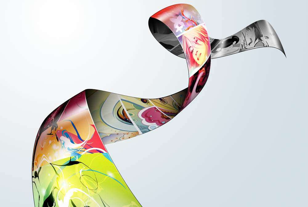
This is a Photoshop tutorial on how to create a beautiful photo film strip, as seen in Apple’s iLife package design (’06 version) and DigitalMash website. The warp tool will be used to create the twisting effect (so, you need Photoshop CS2 or above to complete this tutorial). With the completion of this tutorial, you will be able build a photo strip with your own photos or artwork. Don’t miss out this fantastic feature!
Read more…
1. Create a Strip (Vector Shapes)
First, create a strip with the Pen tool (either in Photoshop or Illustrator). We will use these shapes as a guideline and for masking purposes.

2. Photo Stack
Choose 3 photos of your choice and stack them together.

3. Warping (Photoshop Warp Tool)
Adjust the layer opacity to 40 or 50% so you can see the guideline underneath. Go to Edit > Transform > Warp. Now you should see a grid and 4 anchor points in the corner. To bending the image, simply drag the anchor points, direction points, or grid lines.

Repeat this step for the rest of the strip. Since this step is relatively simple and repeatitive, I’m not going to get into the details. Here are the screenshots of the steps:


4. Masking
Organize the layers into groups (ie. strip 1, 2, 3, 4).

Load selection from the shapes you created in step 1 and add a layer mask for each group (so you get a perfect smooth curve).

5. Shadows
In masked group 1, create a new layer above the strip. Use the Gradient tool and drag from the top to bottom to create a black gradient.

Repeat this step for the other strips.

6. Highlights
To make highlighted and glossy areas: create a round glowing circle, compress it, and rotate it in the angle according to your strip’s direction.

7. Line Strokes
To make line strokes: load a selection of the mask, create a new layer, fill it with black, shift the selection to the left by 1 or 2 pixels, delete the selected area by pressing the Delete key.

8. Final Touches
To make the image look more interesting, desaturated the two strips in the back.

Chroma Wallpapers Step by Step Tutorials
This tutorial explains how to create a energetic, vibrant, colorful wallpaper, like the ones available at Color Charge. These lines, which we’ll call Chroma were highly inspired by the iPod Nano Ad from 2006 and some Quantum Chromodynamics nerdery stuff. You will learn how to bend blurry shapes with Warp tool to draw the lines, beams, and steams. Then you’ll know how to add some glowing and vibrating color effects, and finally polish your drawing. Aside reading this tutorial, you’ll need Photoshop CS2 or CS3, and preferably a computer with a lot of memory and a larger screen to achieve that effect.
Read more…
Initial setup
Start with a very, very large screen: 3000 px x 2000 px wide. Draw a rectangle as background for the whole area and fill it with a dark linear gradient layer style. Align that gradient with 45 degrees vertically (sometimes you may change that angle to 90 or 60 degrees). Since the beginning, pay special attention to colors: black and dark violet as base color. The waves colors will match a triad complementary balance with the base color, in our case, the violet-cyan-orange axis.

Warp Tool
Draw lines! Many parallel lines (horizontal or vertical, or both!). Group them, duplicate, rasterize, group, duplicate, rasterize… and finally add some blur. In this example I used white as base-color for the line themselves (white is the easiest color to balance and add glowing and other layer styles):

After you reach a wide and tall group of lines, is time for some magic: randomly distort the shape with Warp Transform Tool ( Photoshop > Edit > Transform > Warp ):

One thing you’ll probably notice is the amount of confusing structural lines crossing over the shape; your first attempts are going to be almost trial-and-error, later you’ll get used to this really amazing tool and will master the shapes of Chroma. Don’t worry trying to find the perfect shape so early, things will fit better together when you have more than 5 separate shapes matching a pattern or a familiar shape.
When complete, remember to press the Enter key, or click on the Apply Warp button, on the top. If your computer survives the intense rendering and image post-processing… 

Remember to use the Erase Tool to remove sharpen edges and give the wave a surreal looking. Explore other combinations of shapes, lines, and textures - they’ll enhance your drawings.
If you did a small shape I don’t recommend you size it up or even warping again. The Warp tool isn’t that smart because you’ll be playing with rasterized shapes - not smart objects or vector shapes. If you insist warping the same shape again, your shape is going to get some unwanted sharpen or sometimes blurry edges (depending on your case). To avoid that, I recommend you the opposite way: start with a very large area and a large shape, then size it down. Better results, easier to distort.
Glow, screen, multiply, and other layer styles
When you have the perfect shape, you will need to add its soul, I mean, the layer styles :). Again, open the layer styles panel, and mix Gradient Overlay with Outer Glow styles, and combine them with Screen, or Overlay as layer Blending Mode. A secret hint: when glowing, try using brightly and vivid colors, such as yellow, lime, pink, or cyan, picking the color that is in complementary contrast with the dark gradient we did on the beginning.
To achieve the Chroma effect, I used a gradient fill (yellow to gold), plus the following Outer Glow styles with the following configuration:

Brush polishing
Bring your drawing to life with motion. Add some scattered round dots to simulate speed and movement. Within the Brushes panel ( Photoshop > Window > Brushes, or F5 ), explore the sizing, scattering (with fade), spacing, and pressure:

The big cells are just the way the smaller ones, except the size and spacing. A bit of randomness is really welcome and exciting:

The "range" option in this step is very important - it will give a cellular-looking to the glowing particles - like if they were intensely vibrating:

Poor kid…got any blurry edge? Don’t worry. Use the blur tool and correct that.

Finalizing the drawing
Be creative and fearless to do a complete mess with the shape - in my experience, the messier the better. Size down the area and crop. Draw as many layers as your computer’s memory can handle. Sometimes you won’t be able to merge layers because the effects and styles that were applied. Also use layer’s blending and opacity to give your shapes a translucent appearance.
Our final result, after cropping:

Conclusion
Now is really easy to get waves, brightly flowing across the infinity of color…okay, I went a bit far ;). I hope this tutorial helped you. If so, please let us know more about your artworks and drawings based on this tutorial on the comments. Thank you!
How to Create a Grunge Web Design Using Photoshop

In this step-by-step web design tutorial, you will learn how to craft a beautiful and eye-grabbing grunge-themed web layout using Photoshop. This tutorial is geared for beginners and intermediate-level Photoshop users.
This is a two-part tutorial series that will show you how to create a grunge web design using Photoshop, with the second part as a follow-up web development tutorial providing you instructions on how to convert the design mockup to a fully-functioning web page using standards-based HTML and CSS.
Final Result
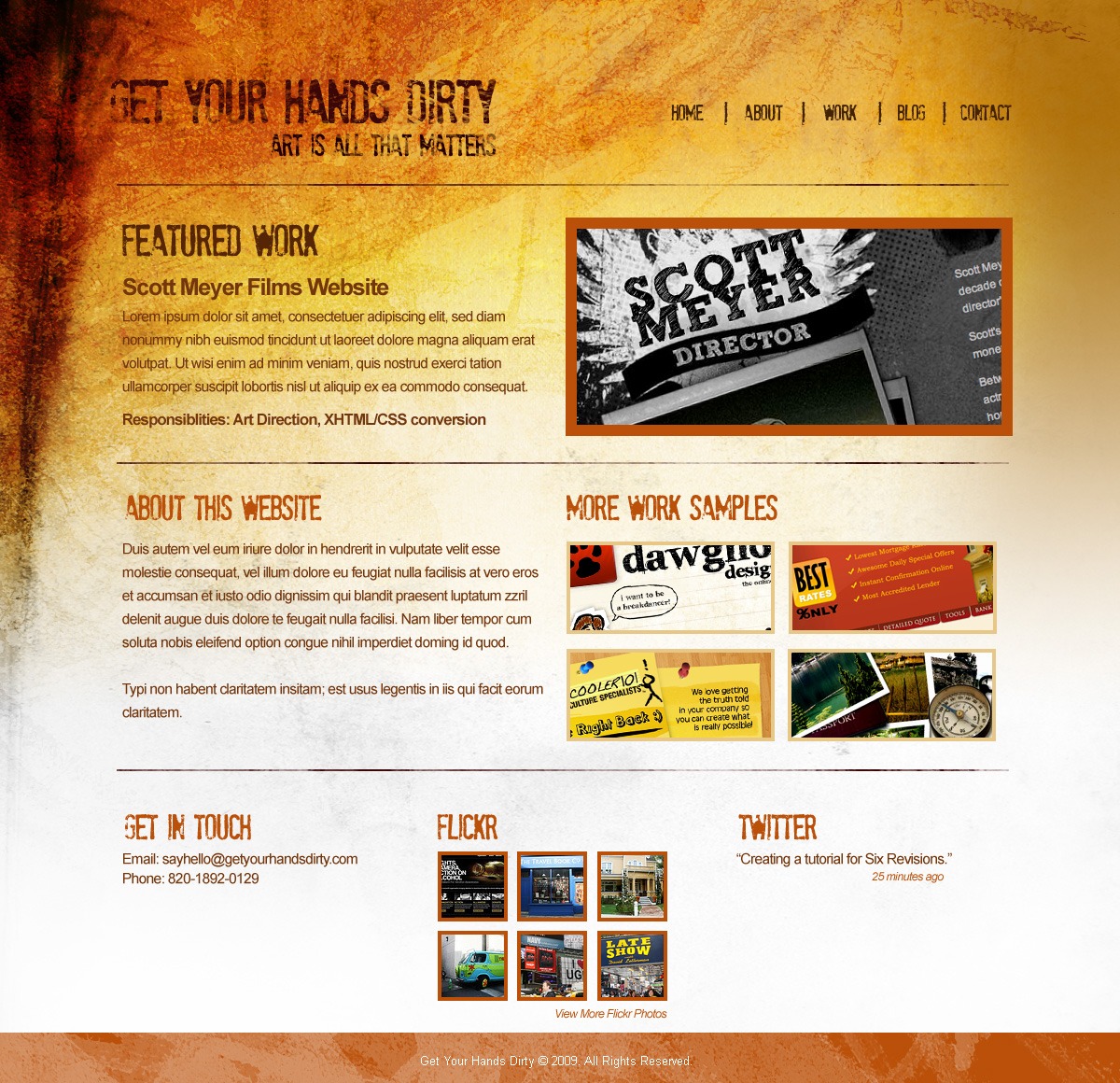
Click on the following image to view the full-scale version of the design that we will be creating together in this Photoshop tutorial.
Setting Up the Photoshop Document
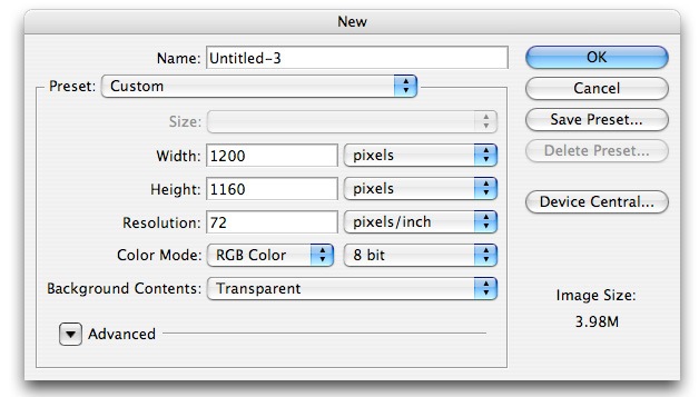
1 Create a new document in Photoshop with the dimensions 1200px x 1160px and with the document settings shown in the following figure.
Creating the Layout’s Background
2 On the first layer, create our background using the Gradient Tool (G). Make sure Linear Gradient is selected as the Gradient type. Set your Foreground color to #9D6000 and Background color to #FFFFFF.

3 We will add some texture to our gradient background. Download the set of Light Grunge textures from Bittbox.com. These textures are free for both personal and commercial use but are not to be sold or redistributed in any way. We will use several textures from this set, so for convenience, keep the contents of the set handy throughout the tutorial.
Open the file called 3484741593_7575a6ebc7_b.jpg in Photoshop, File > Open… (Ctrl + O). Drag this texture onto our design and change this texture’s Blending Mode to Overlay. Using the Transform Tool (CTRL + T), make this texture fit the size of the canvas by dragging the transform controls around the texture.
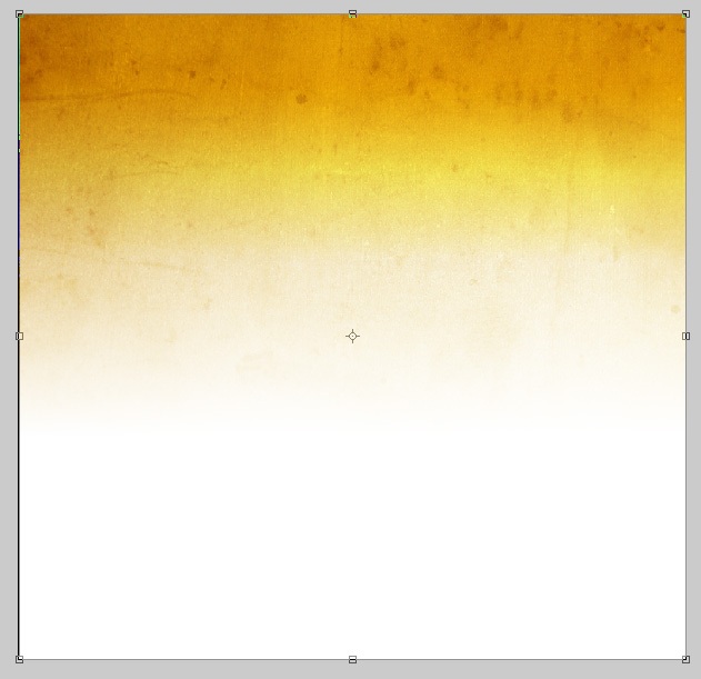
4 Using an ordinary feathered Eraser (E) with a 300px Master Diameter and its opacity set at 21%, erase the right side and far bottom areas of the texture. The following figure shows which areas we will be erasing (check the highlighted areas of the image). We are doing this because the website we are about to create is meant to be left-aligned. By erasing in the manner specified, we need not worry about having to tile the textures seamlessly, we only need to tile the gradient background.

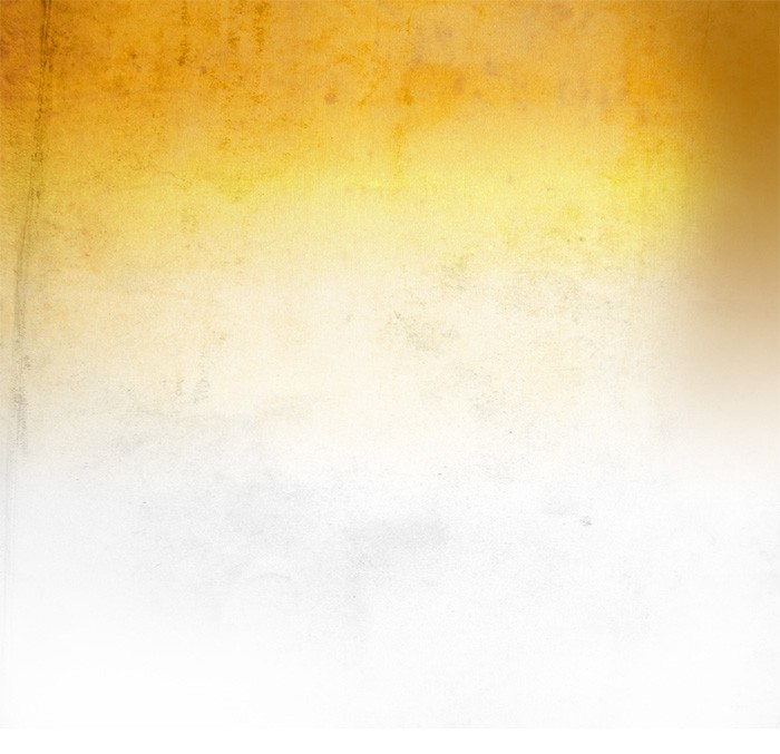
5 From the of Light Grunge textures set, open 3484744611_f995d6c67f_b.jpg in Photoshop and then drag it onto our canvas. Using the Transform Tool (T), rotate it 90 degrees clockwise. Change this texture’s Blending Mode to Luminosity and the layer’s opacity to 39%. Repeat Step 4 for this texture, erasing parts of the layer with a soft featured eraser.
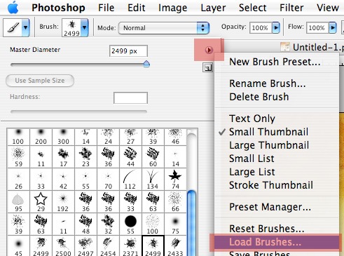
6 Download the Ink Scribbles Brush Set from FudgeGraphics.com. These brushes are free for both personal and commercial use but are not to be sold or redistributed in any way. Activate the Brush Tool (B) and load this brush set by clicking the tiny arrow as shown on the image below.

Once the brush panel shows up, click on the other tiny arrow and click on Load Brushes. Refer to the following figure below.
7 Create a new layer above the textures. With the Foreground color set to #000000, use the 6th brush from the Ink Scribbles Brush Set we downloaded.

Click once on the upper left side of our canvas to apply the brush stroke. It is not necessary to show the entire brush. Position it in such a way that only the bottom right part of the brush stroke will appear on the canvas.
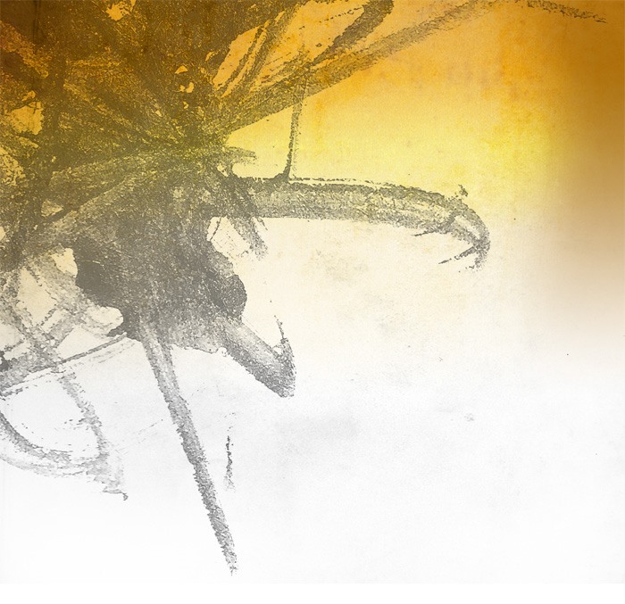
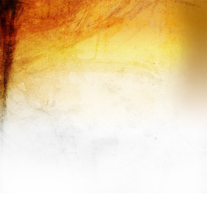
Change this layer’s Blending Mode to Overlay and the layer opacity to 52%. We should now have something like the following figure.

8 Repeat Step 7, but this time, use the 9th brush from the Ink Scribbles Brush Set.

Set the Blending Mode of this layer to Overlay and decrease the opacity value down to 41%. We should now have something like the following figure.

9 Create a new layer. We’ll use the 6th brush from Ink Scribbles Brush Set, but with a brush’s’ Master Diameter adjusted to 432px. Click on the upper left corner of the canvas to apply the brush stroke.
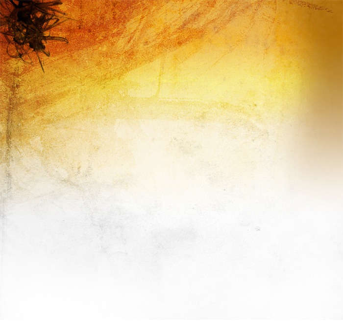
10 Using the Smudge Tool with a Feathered Brush selected, smudge the layer by clicking and dragging your mouse on the canvas in a downward motion. Do this until you get something like the following figure.
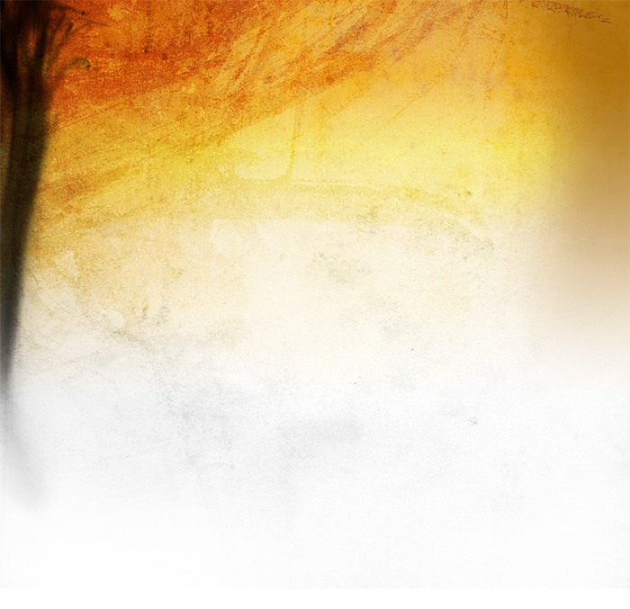
11 Change this layer’s Blending Mode to Overlay and its opacity to 35%. Now you should have something like the following figure.
Setting Up Photoshop Guides
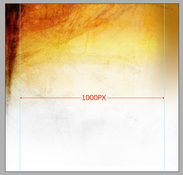
12 We are now going to add the content. Make sure that our content is centered on the Photoshop canvas, not exceeding the 1000px in width. To ensure that we keep our site content inside 1000px, use Photoshop Guides by dragging them from the Rulers on the left and top sides of Photoshop (refer to figure below).
Making the Website Logo
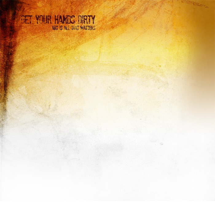
13 Using the Horizontal Type Tool (T) with a color set to #3A0707, add the title to our mockup; this will serve as the site logo. Here, I used the font called Stam Pete from dafont.com. This font is free for personal use only. If you want to use another grungy font, you can find a large collection of grunge fonts on the dafont.com.
Making the Site’s Primary Navigation
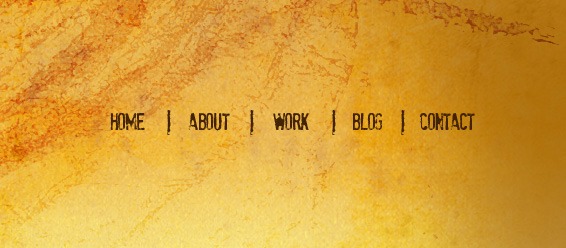
14 On the right-hand side of the logo, add the navigation text using the same font and color.

15 Add a division in between each navigational item. Using the Horizontal Type Tool (T) and the same font and color, type the letter "I" in between each navigation item, effectively creating vertical dividers in between them.
Note: the font size of the divider must be increased in such a way that it is slightly bigger than our navigational items.
Duplicate the letter "I" 4 times and spread it across the navigation evenly.
Making the "Featured Work" section
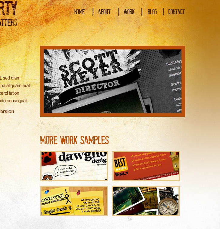
16 Below our title and navigation, we will add a "Featured Work" section. Add a photo or screen capture of your personal work (to serve as a thumbnail). Add a description of the work on its left. The same font (Stam Pete) is used in the heading, and the rest of the copy is the web-safe font called Arial.

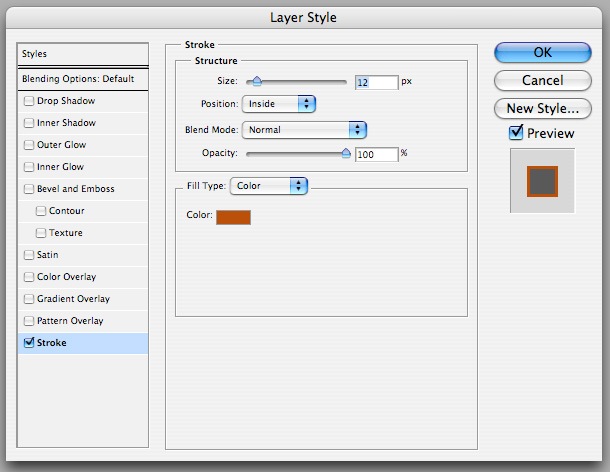
For the featured work thumbnail, add a stroke around it by right-clicking on the layer and selecting "Layer Styles…" on the context menu to open the Layer Styles dialog box (alternatively: double-clicking on the layer will also open the Layer Styles dialog box). Use the settings below for the Stroke blending option. The color of the stroke is #BA5009.
Making the "More Work Samples" Section
17 Now, we’ll add a "More Work Samples" section below the "Featured Work" thumbnail. For the heading text, use the color #BA5009.
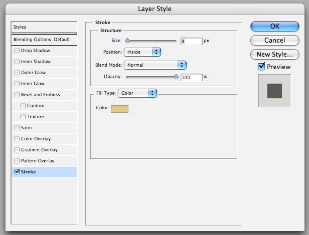
For the stroke around the thumbnails, follow the same instructions in Step 16. The color of the stroke is #E7C788.
Designing the "About This Website" Section
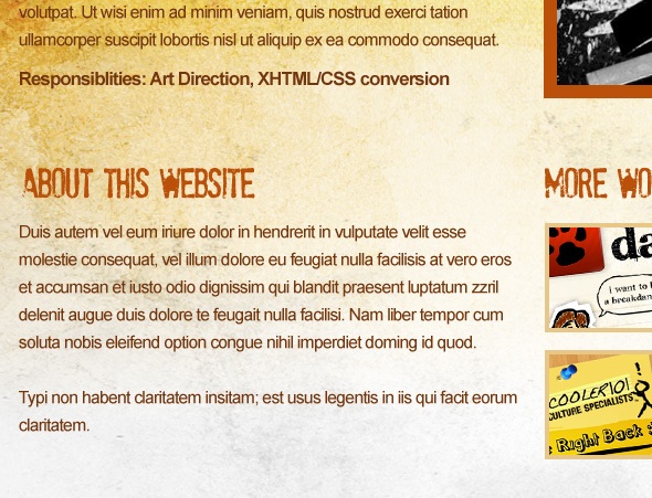
18 On the opposite side of the "More Work Samples" section, add an "About This Website" section. Use the same font type, font size and font color that we used for the "More Work Samples" heading. Use Arial for the rest of the copy.
Designing the Secondary Content Section
19 Below our "About This Website" and "More Work Samples" section, we’ll create three sections to accommodate "Get In Touch", "Flickr" and "Twitter" sections. The same font type, font size, and font color from the previous step (Step 18) should be used.
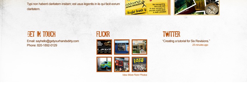
Making the Site Footer
20 Below the three sections we just created, create a selection using the Rectangular Marquee Tool (M). Using the Paint Bucket Tool (G), fill this selection with the color #BA5009. This filled-in selection will serve as the background for the site’s copyright information.
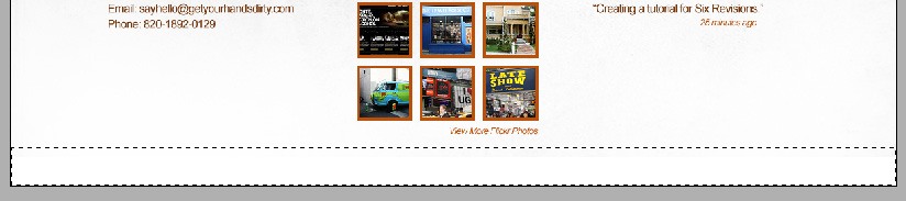
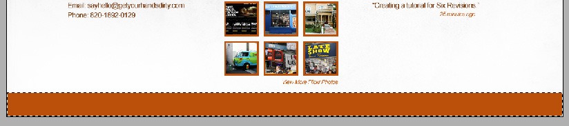
21 Using the Eraser Tool (E), select any of the Ink Scribbles Brush Set brushes we downloaded and change its opacity to 21%.

Erase some areas of the rectangle we just created in the previous step and then add the copyright text at the center of our document using the Horizontal Type Tool (T).

Make sure that when adding the copyright, Anti-Aliasing is turned on. This ensures types in smaller sizes to be more crisp and readable.

Making the Horizontal Dividers
22 Now, we’re going to add divisions to each of our section. Create a new layer. Using the Pencil Tool (B) with a Master Diameter of 2px, draw a straight line across our across our canvas right to delineate the site header. Hold the Shift key when drawing the line to make sure that the drawn line will be straight.

23 Select the Eraser Tool (E). Choose any brushes from the Ink Scribbles Brush Set and reduce its Master Diameter to 97px and opacity reduced to 40%. Slightly erase some of the areas to grunge up and distress the pencil line.

24 Duplicate the division layer twice by right-clicking on the layer and selecting "Duplicate Layer…" in the context menu. Use the duplicated layers to separate each section; use the following figure as a reference.
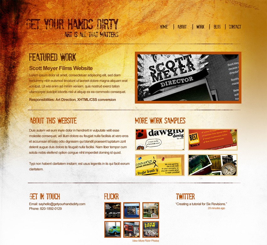
Finished!
Congratulations, we’re finished with our grunge web layout mockup! If you followed this step-by-step tutorial, you should come out with a web design mockup as shown below.
The "Grunge Web Design" Tutorial Series
This tutorial is the first part of a two-part tutorial series that shows you how to create a grunge web design in Photoshop, then how to code the grunge web design mockup into a standards-based (X)HTML template.

